Krazy Krafters: Elevating the Art of Gifting
Role
UX Designer
Timeline
48 hours
Industry
E-commerce
Disciplines
User Research
Visual Design
Interaction Design
Tool
Figma
Project Overview
Redesigning the Krazy Krafters landing page to elevate user experience
The aim was to to redesign the Krazy Krafters website 'Home Page' to increase engagement and drive conversions. A fresh, modern design that would reflect their brand identity while providing an intuitive and seamless browsing experience for users.
Problem
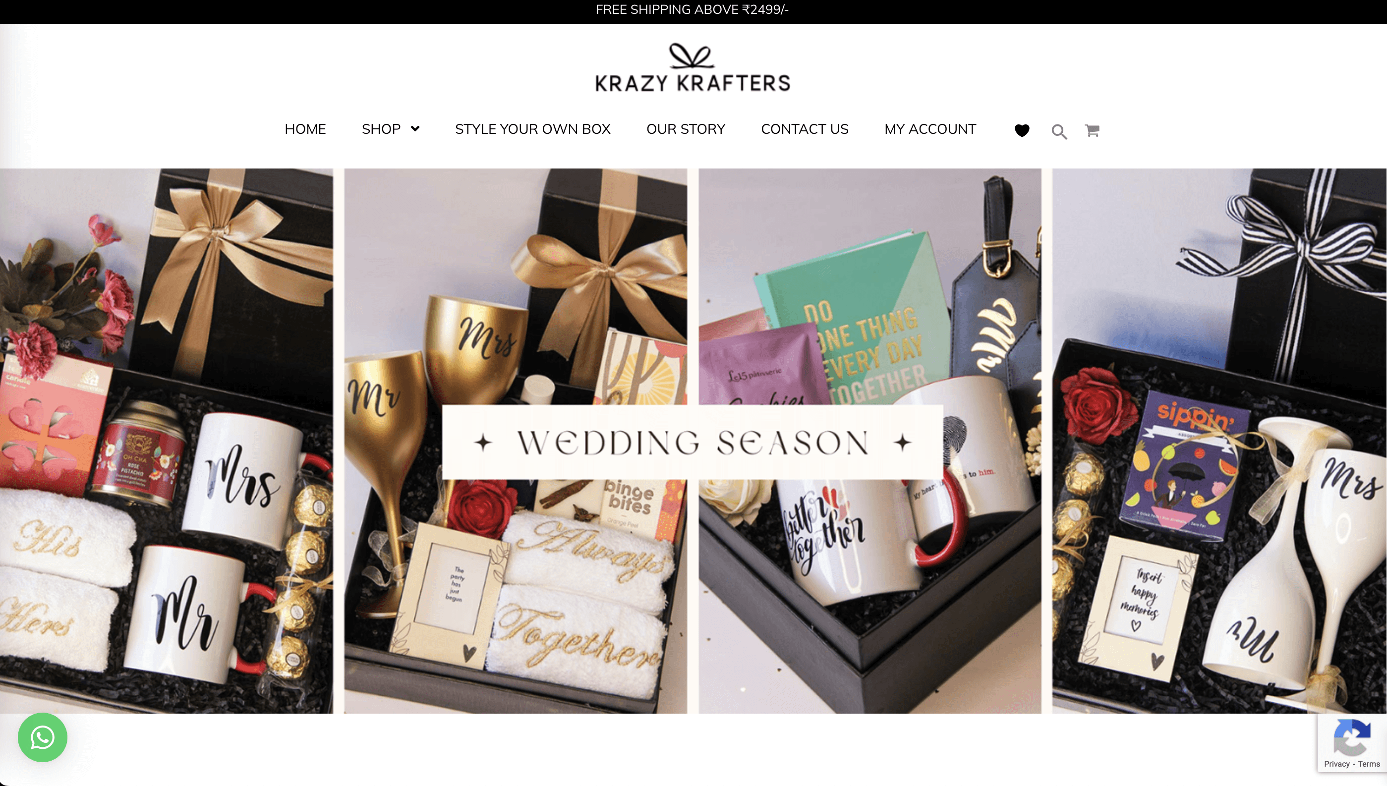
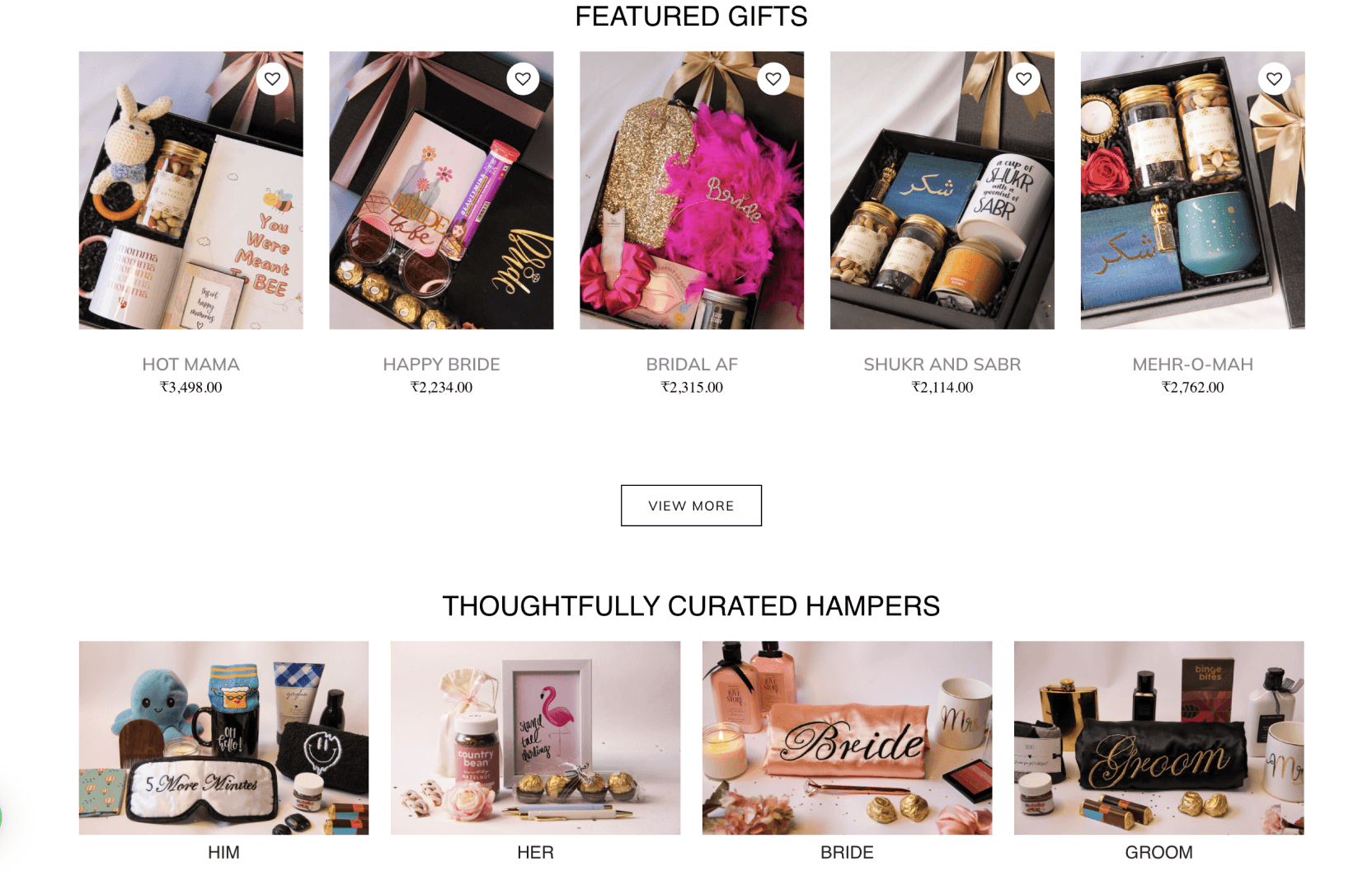
The initial home page layout was overwhelmed with cluttered information, resulting in confusion among users and potentially contributing to a high dropout rate.
Potential Conversions Loss
Important calls-to-action or promotional elements may get lost in the clutter
Negative Brand Perception
A disorganized and cluttered home page can reflect poorly on the brand
Poor Accessibility
Excessive content can make it challenging for these users to navigate the site effectively
The Design Goal
Optimizing Krazy Krafters: Simplifying, Personalizing, and Engaging Users
Improve site infrastructure to simplify user flows and make key functions more accessible
Making the personalized gifting experience seamless
Increase user retention and engagement
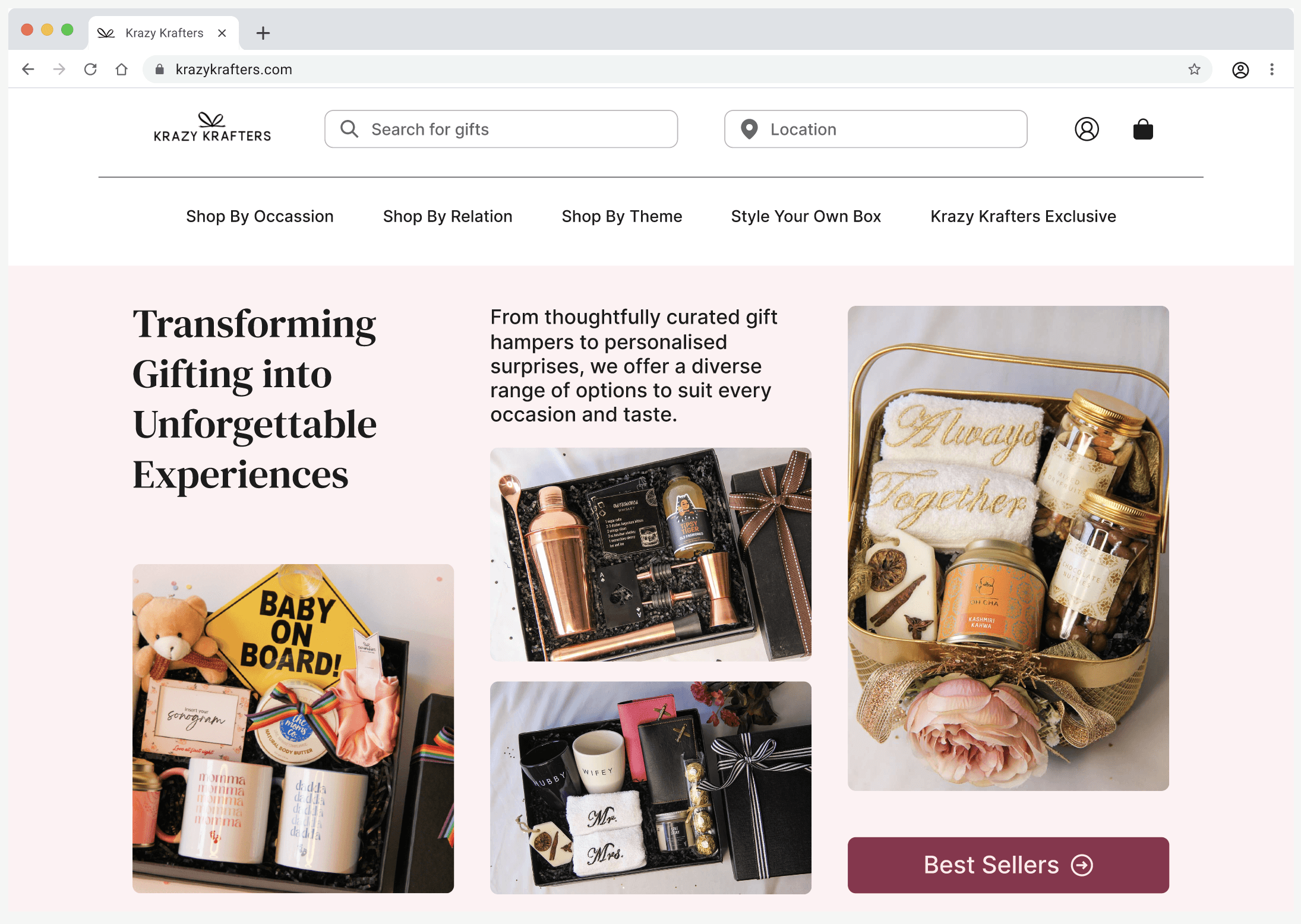
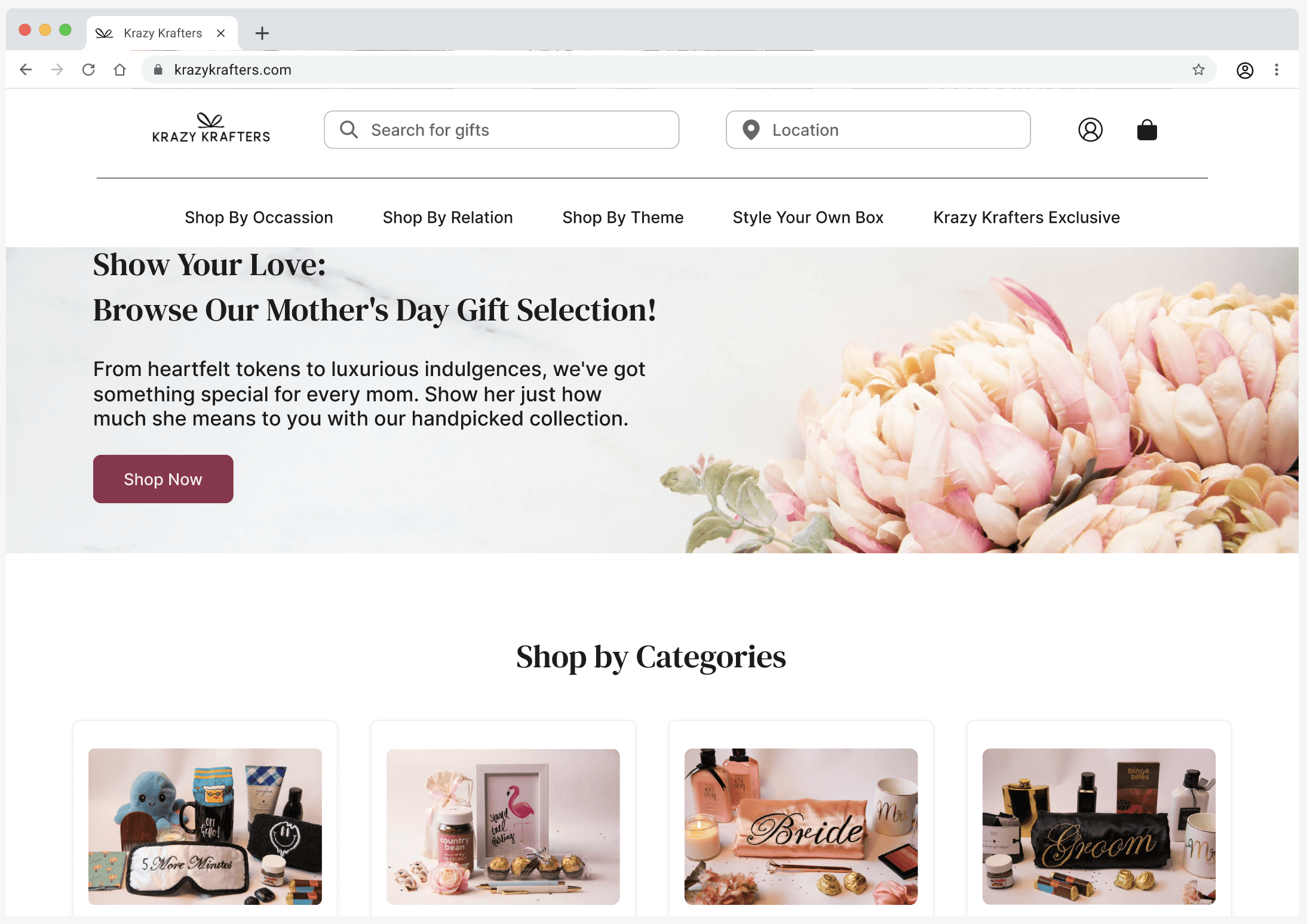
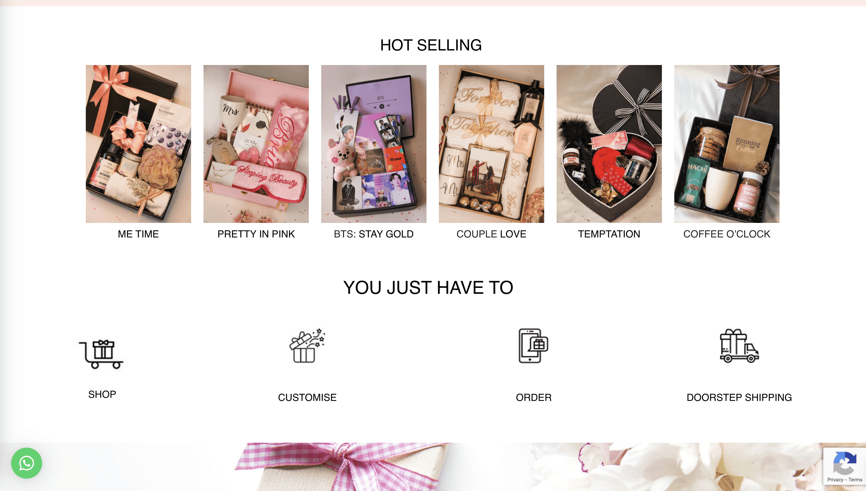
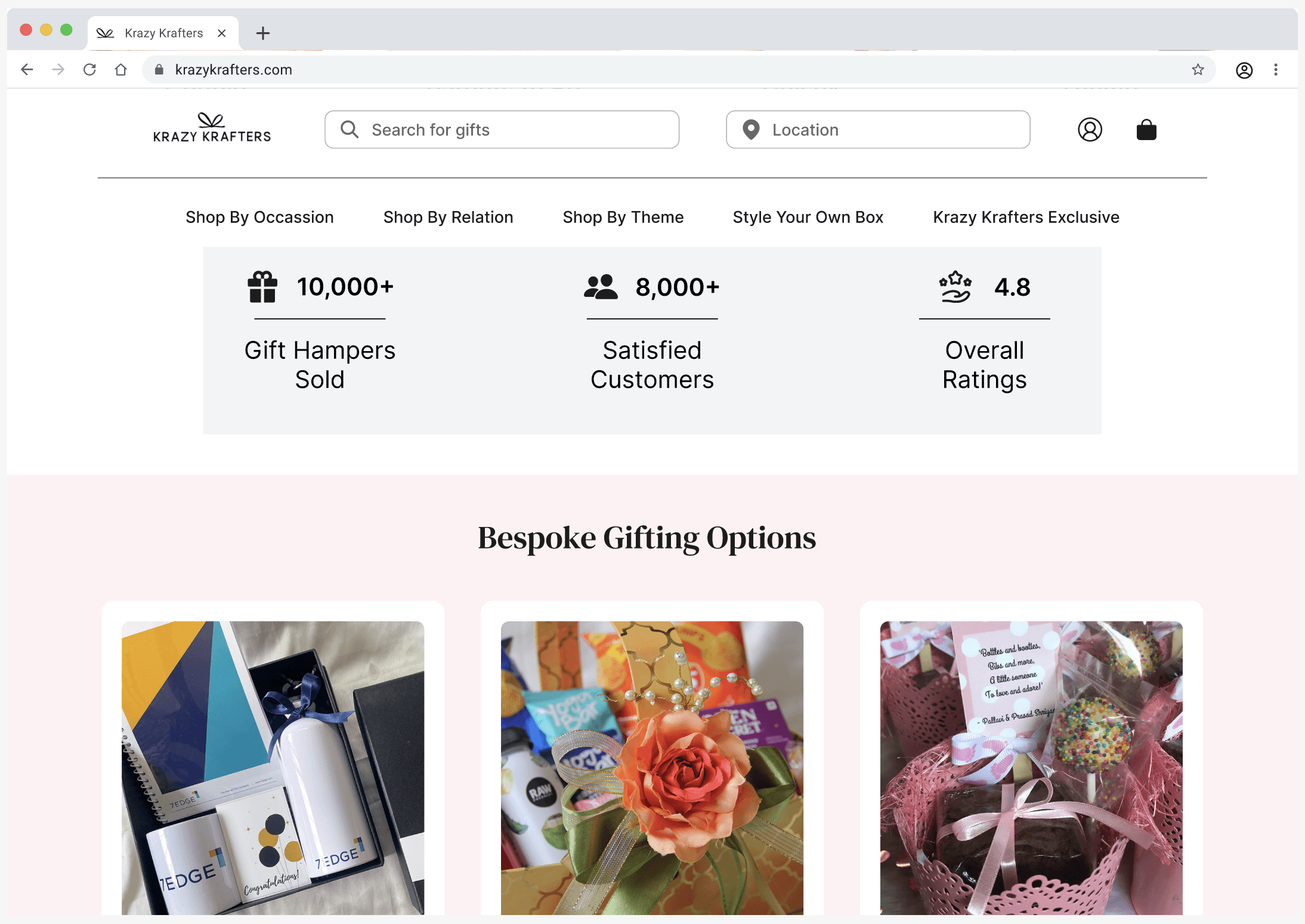
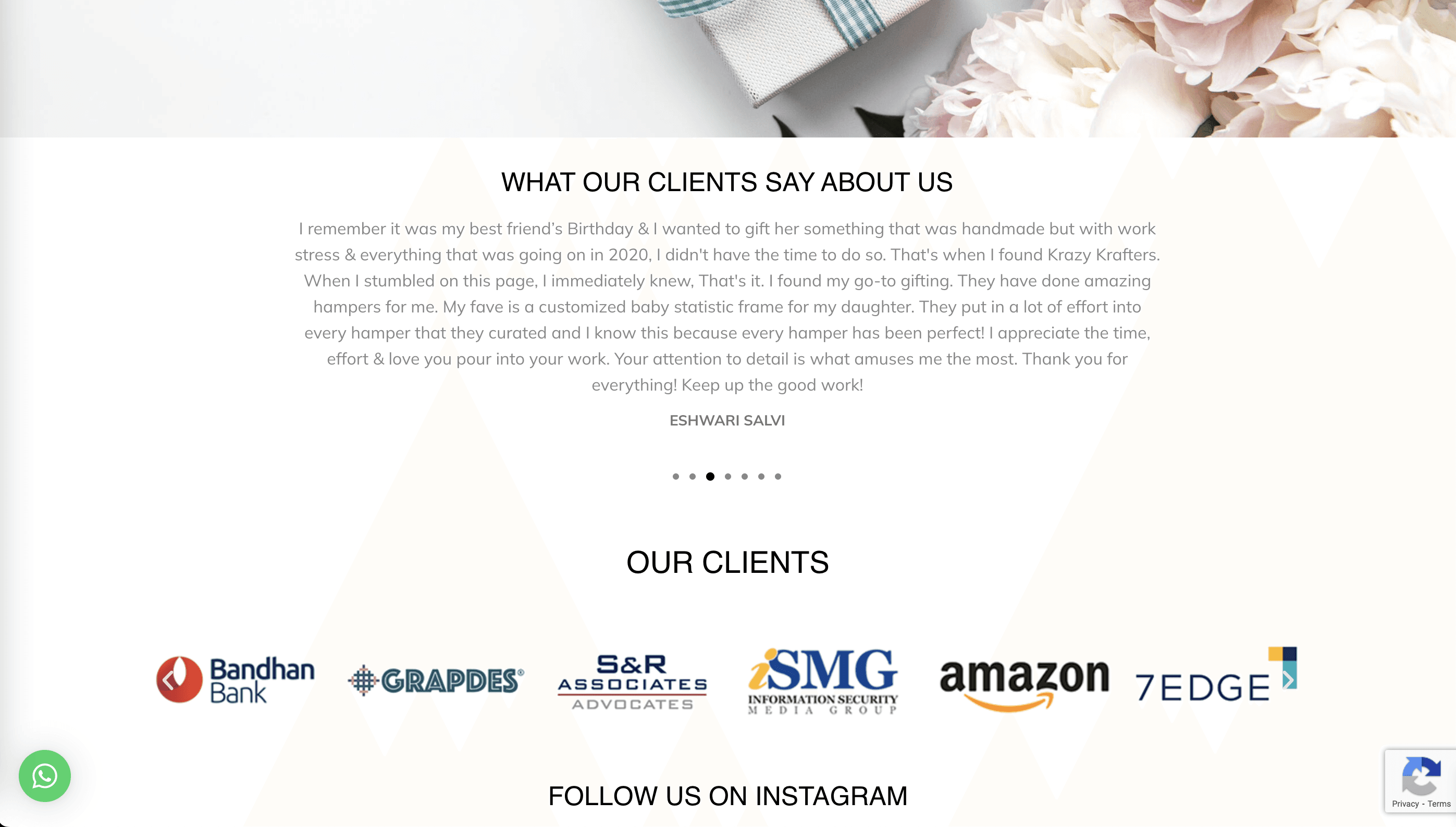
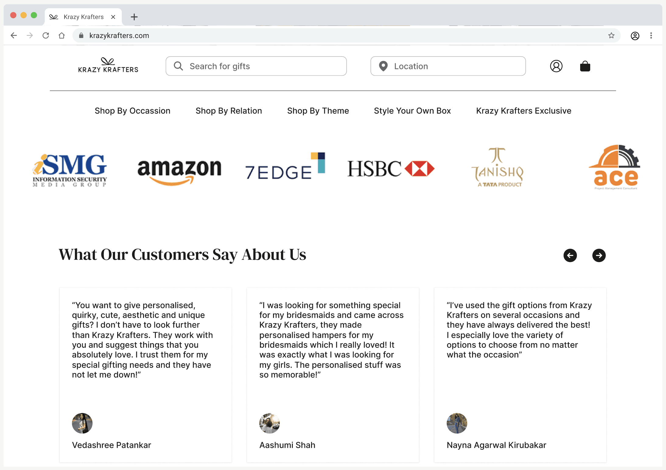
Before getting into my design process, here's a direct comparison of the redesign: a Home Screen that includes everything users need, from customized gifting options to pre-curated gifts.
Before
After

Competitor Analysis
While gifting websites offer a wide range of products, the navigation and presentation of these items often lack organization and clarity.
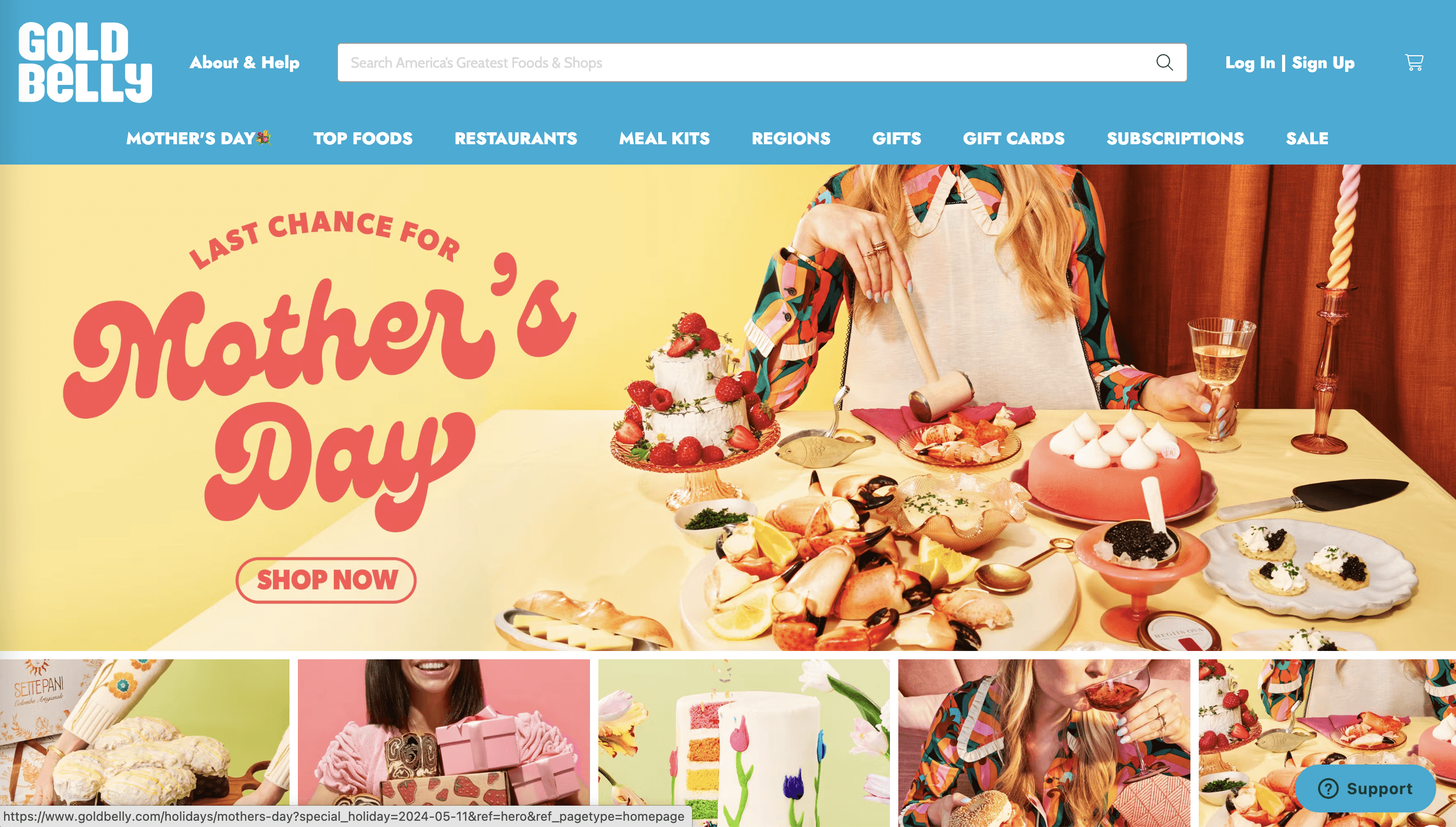
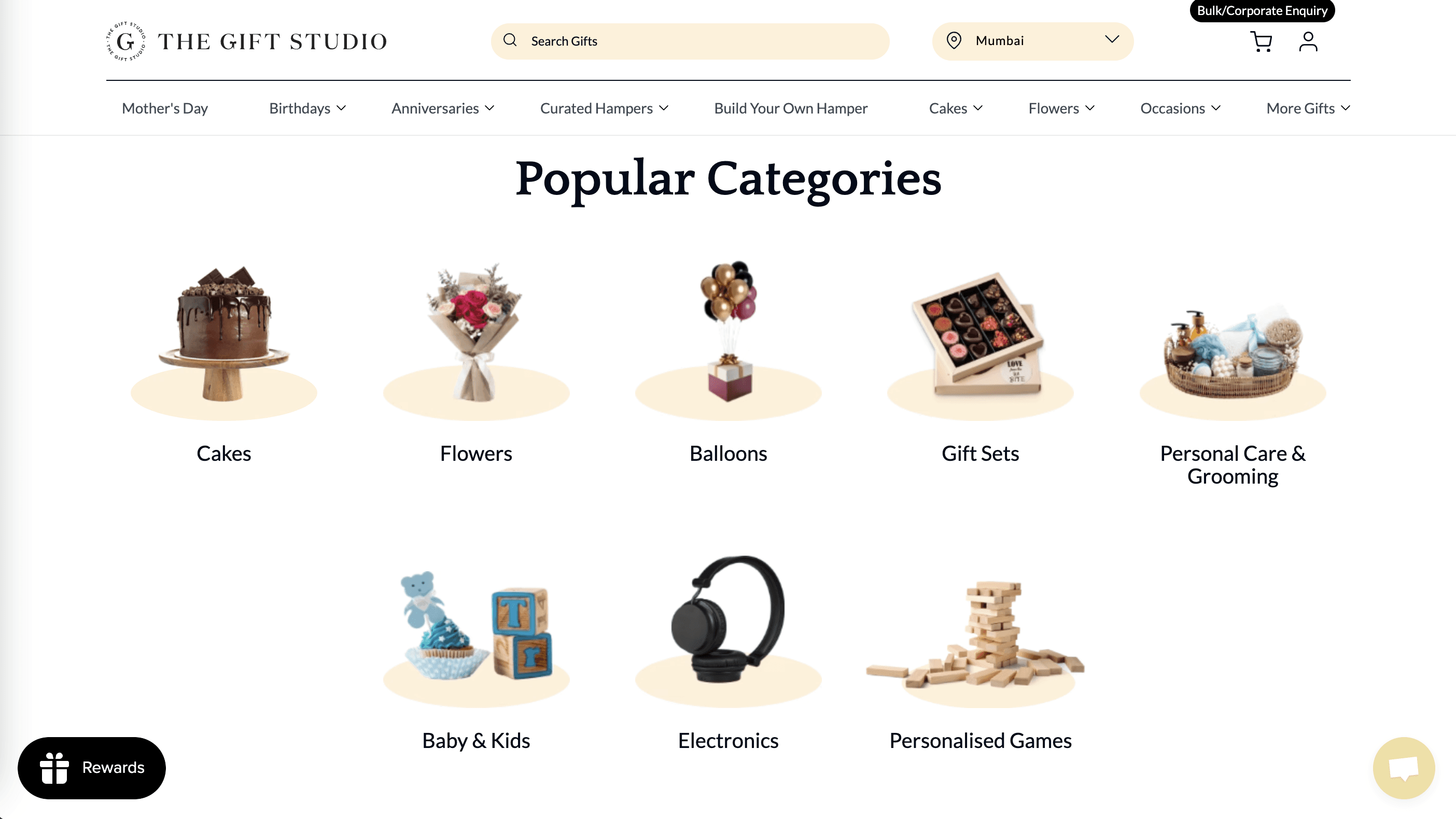
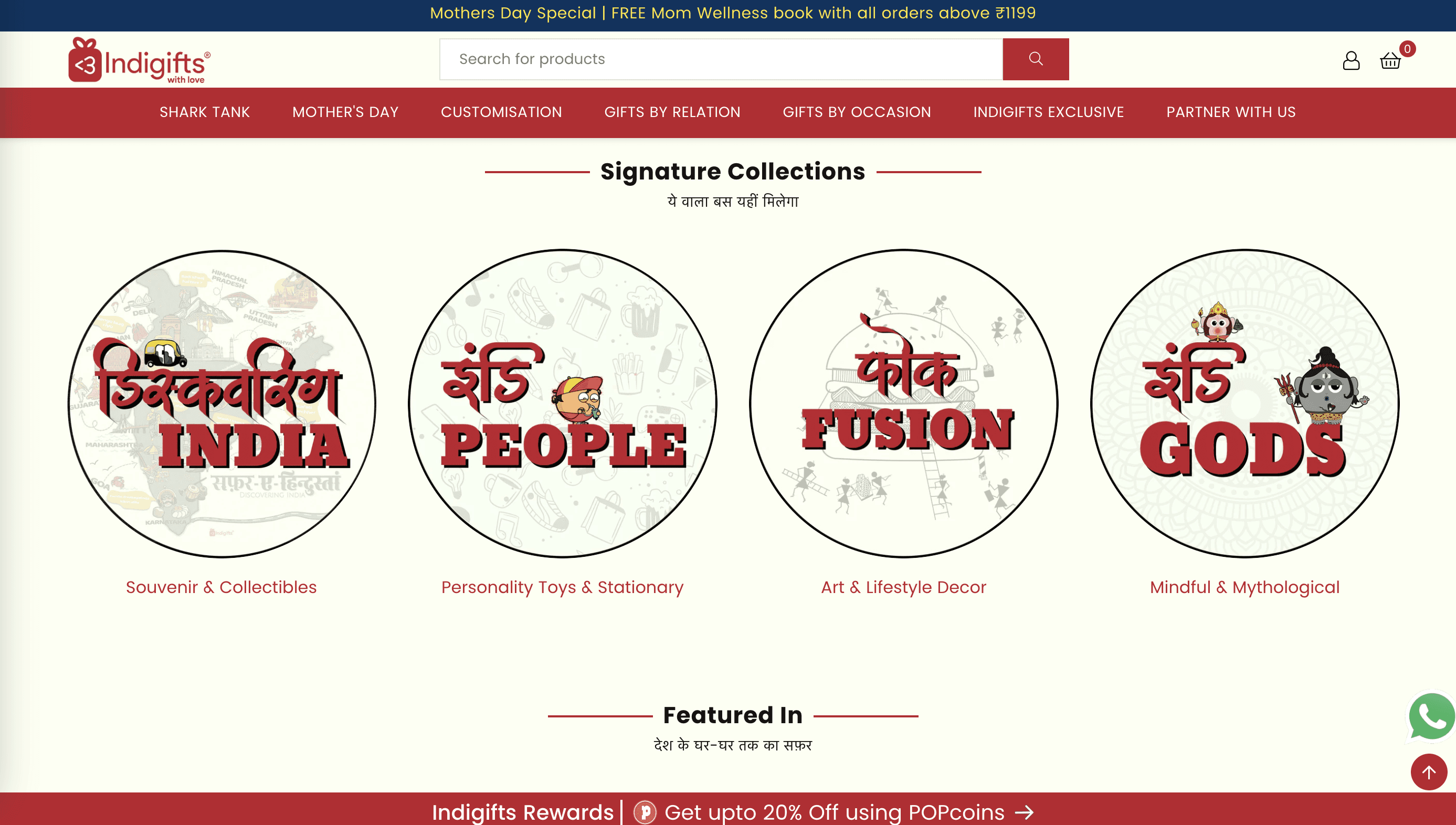
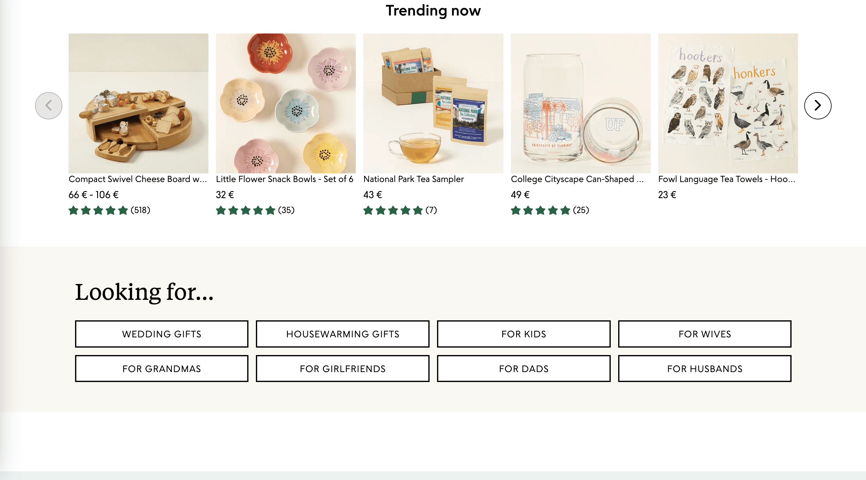
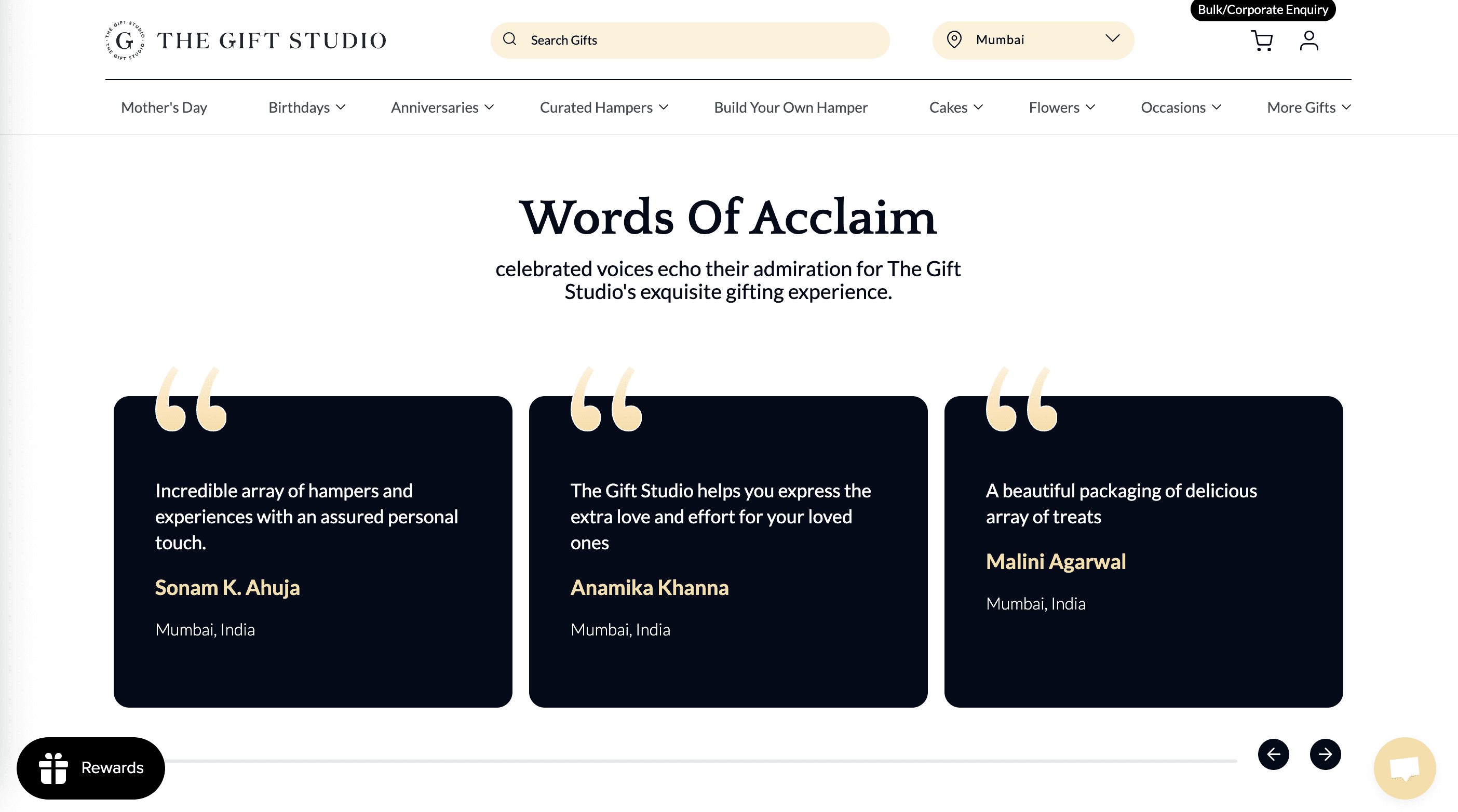
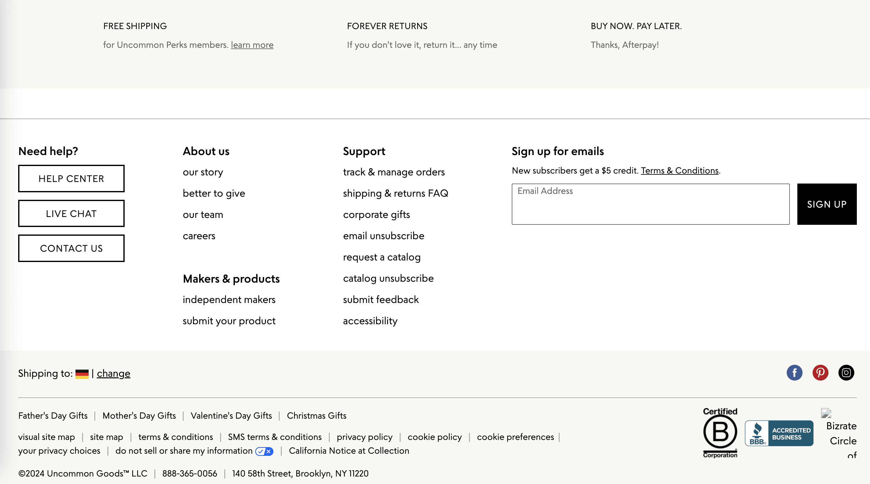
I researched some competitors’ dashboards to find inspiration. What I took away were:
Using modular blocks to present pieces of information on the homepage can best utilize the space
Giving quick links to different types of products and using real images to prioritize them
Showcasing the numbers to build customer trust
Brainstorming & Sketches
Translating Insights into User-Friendly Interfaces
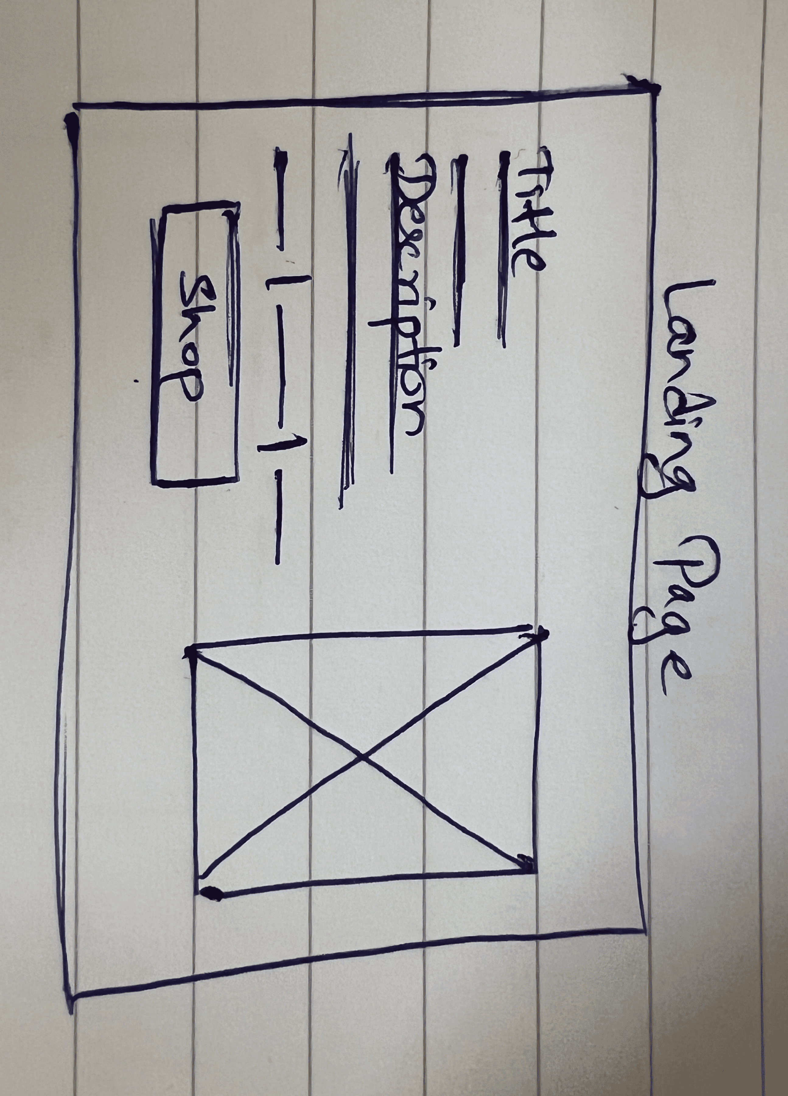
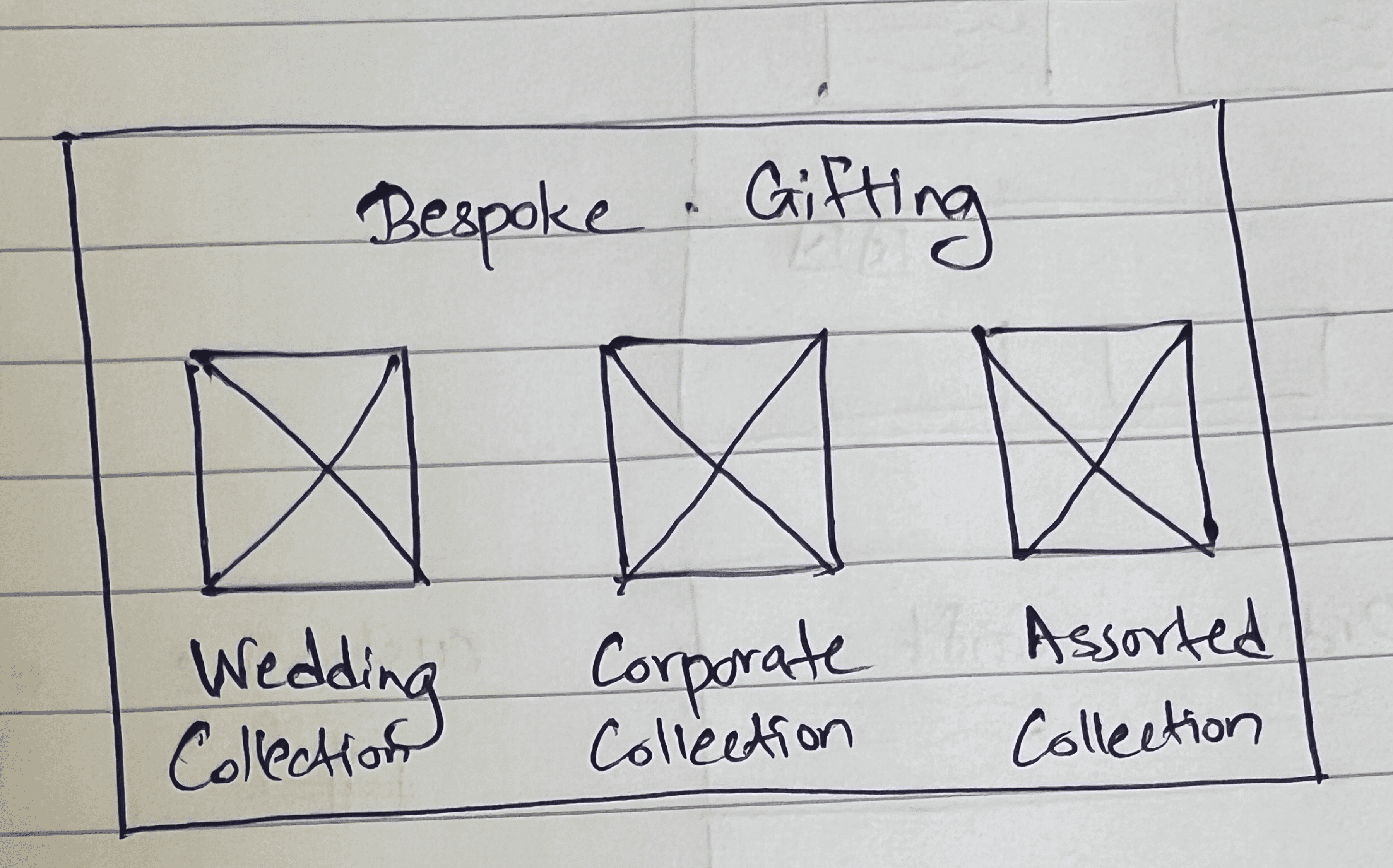
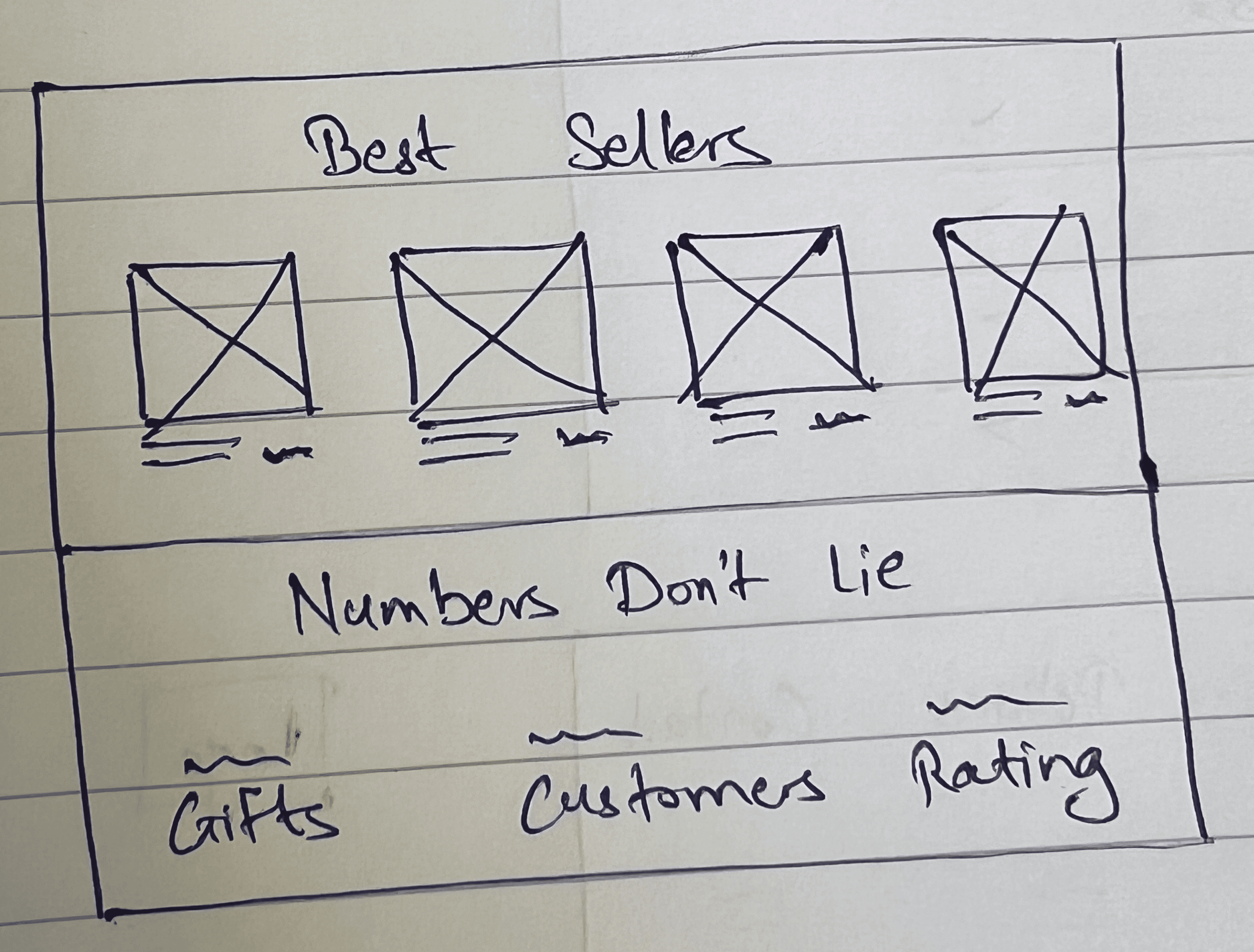
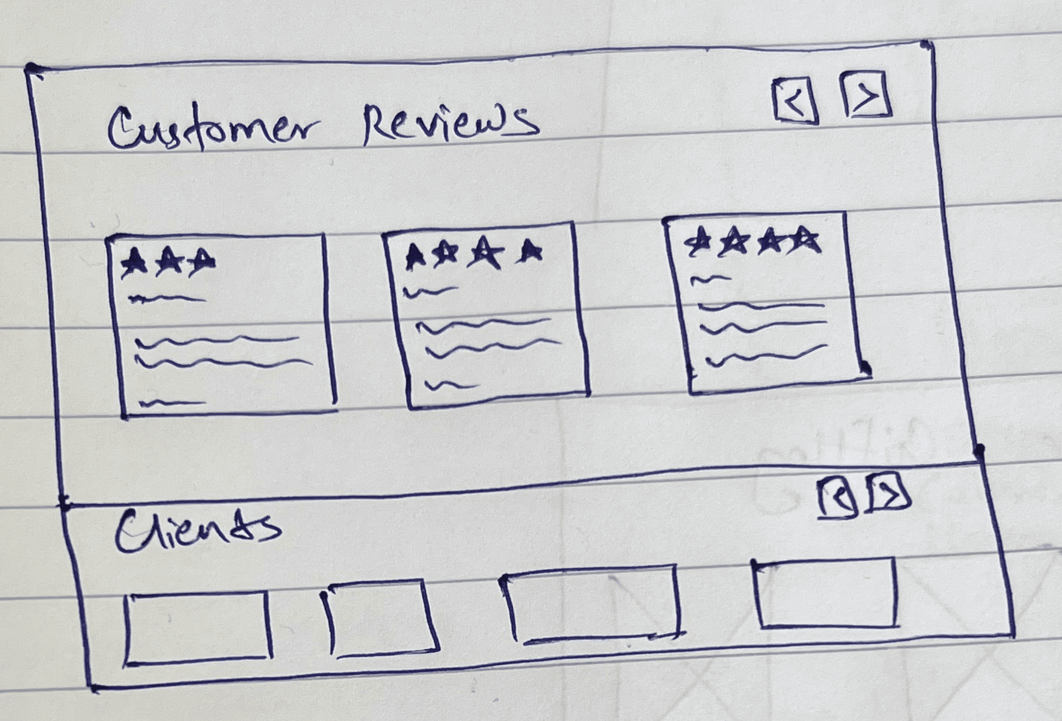
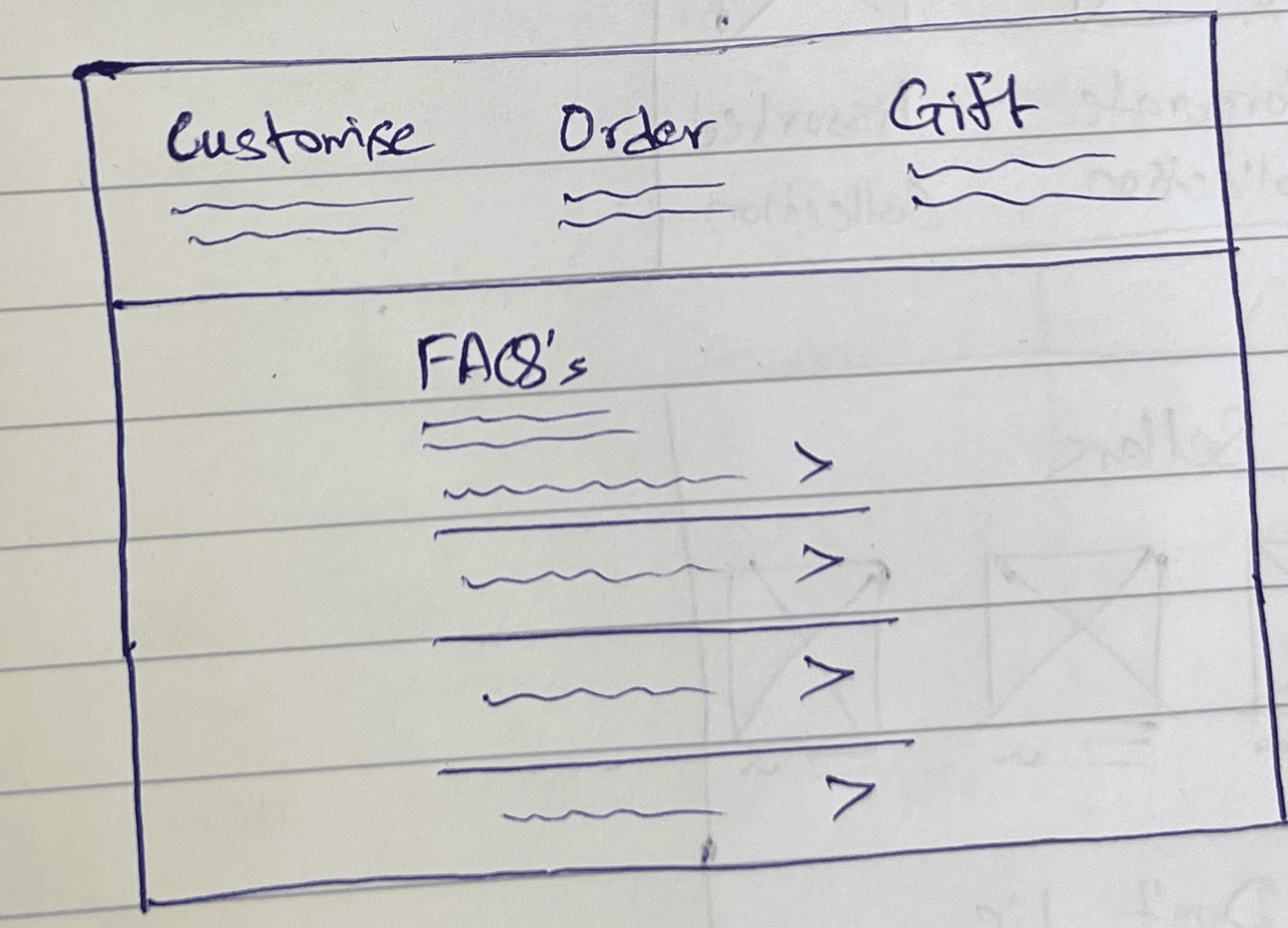
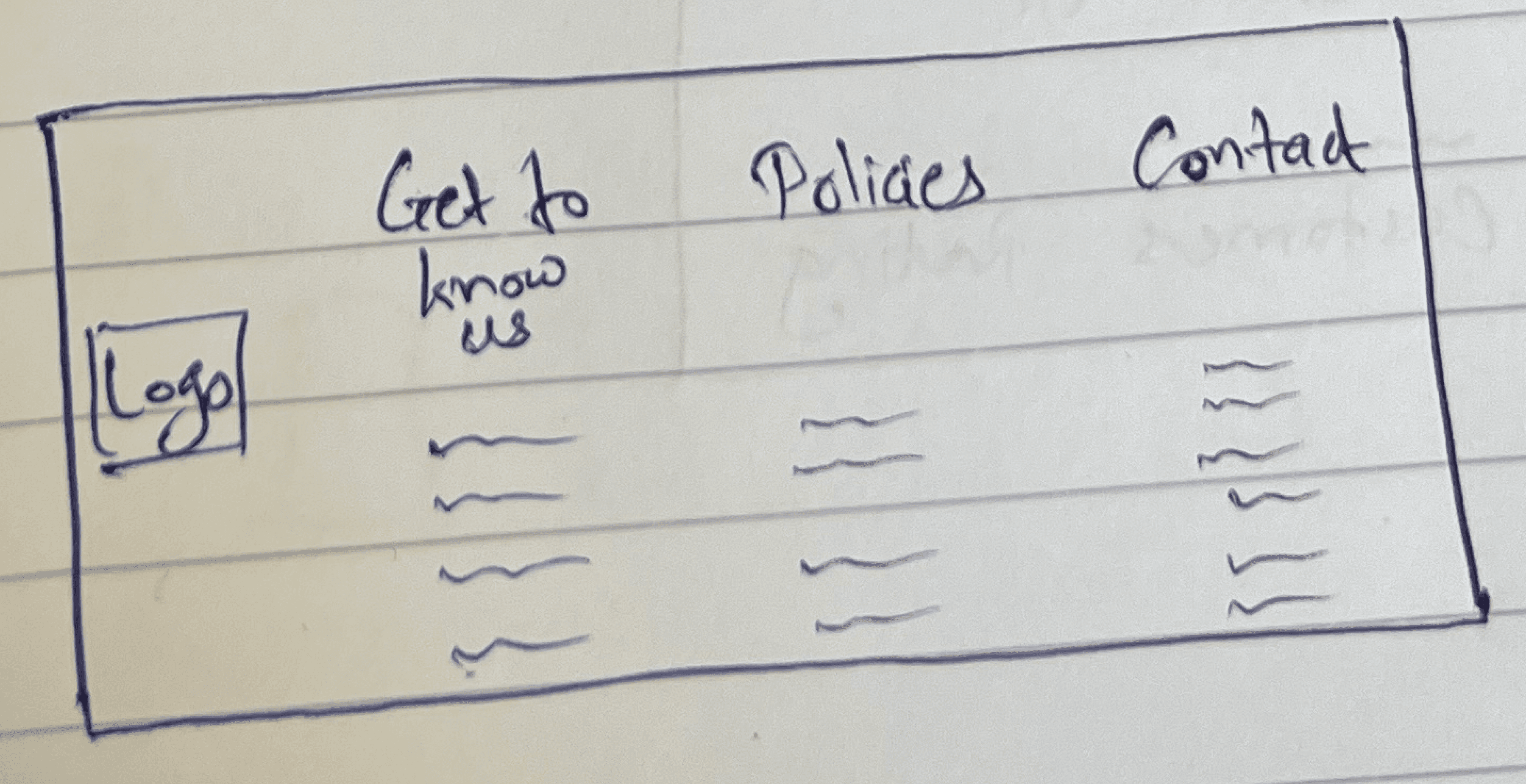
Based on my research I found out that the website has confusing navigation menus and disorganized layout, making it difficult for users to navigate between pages. In response, I brainstormed some ideas to enhance this page. I crafted low-fidelity wireframes to bring to life the new layout and navigation system.
Initial Sketches
UI Design Elements
Revamped Landing Page
I spent a lot of time looking for the most efficient way to display information on the first fold of the screen users see first and foremost. To determine the most important information that should be displayed on this page, I searched for many landing page inspirations to prioritize users’ needs.
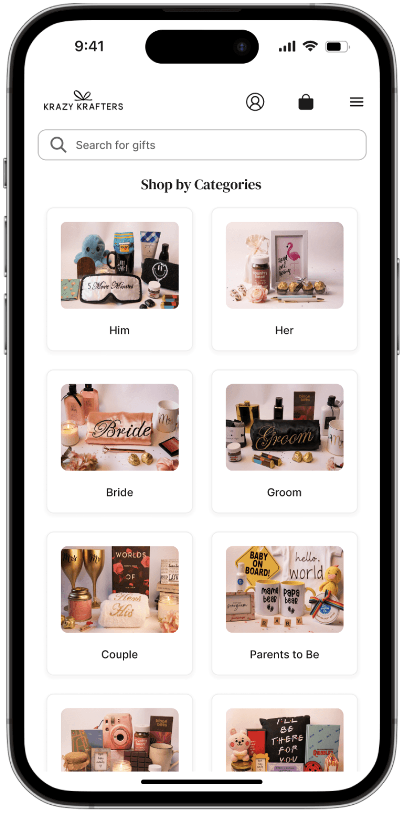
A grid showcasing the bestsellers in first glance

A simple banner showcasing the brands information
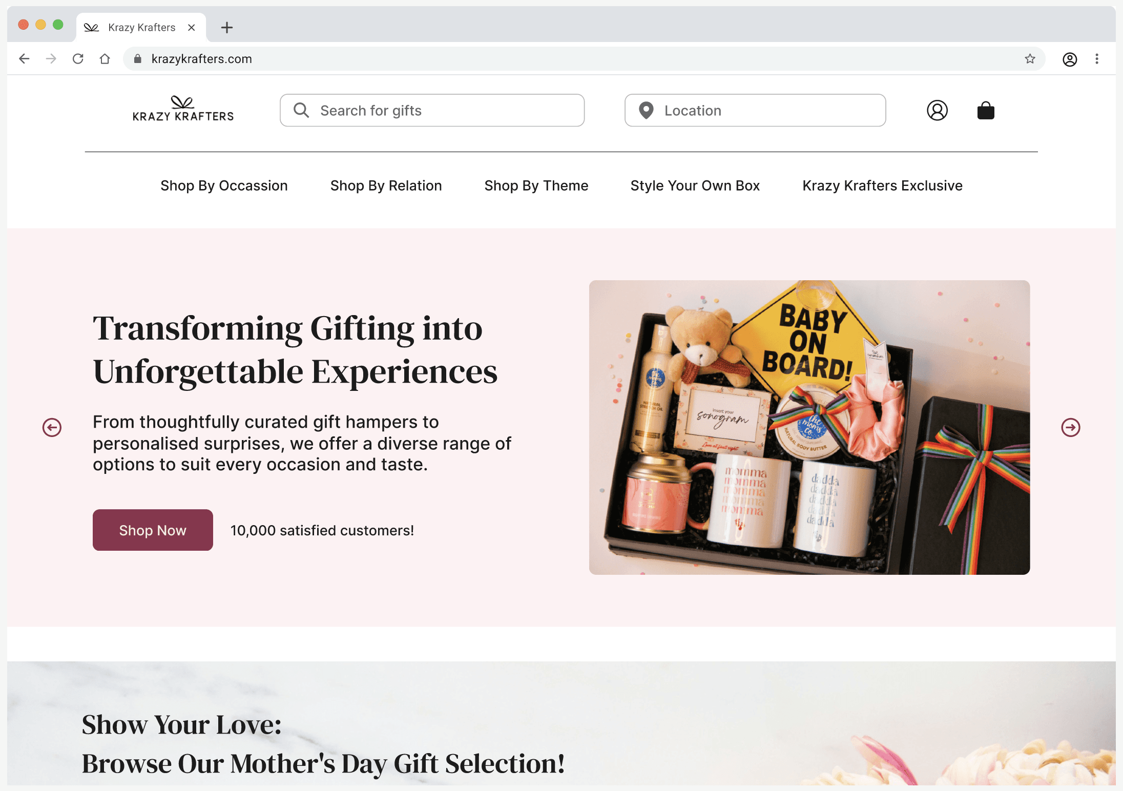
I finalized the grid-style landing screen to prominently display the best-selling products, featuring real-time images to attract more customers and highlight the business's top offerings.

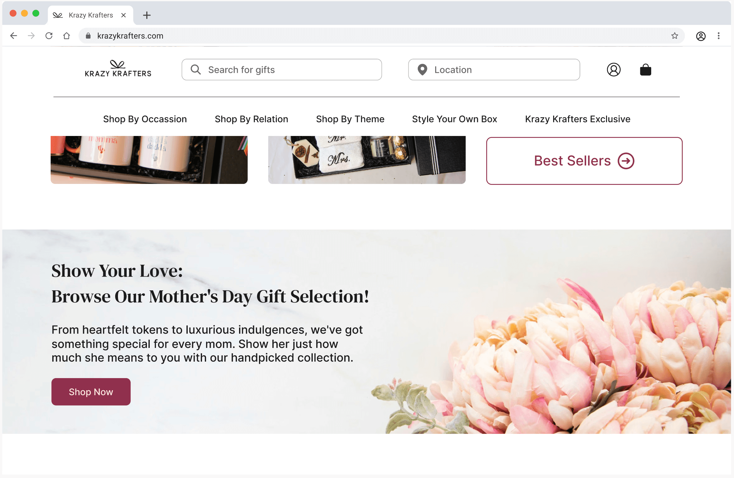
Highlighting seasonal promotions: Mother's Day offers banner
I created a visually appealing banner for the landing page, highlighting Mother's Day offers on gift hampers. This banner is strategically placed at the top of the page to immediately capture users' attention. It features vibrant colors, engaging graphics, and a clear call-to-action
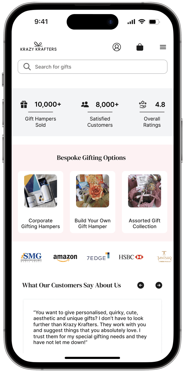
Building trust with numbers
To build customer trust, I incorporated the key statistics such as the number of gifts delivered and customer ratings. This is strategically placed on the landing page to instantly reassure new visitors of our reliability and popularity. By incorporating clean, bold typography and intuitive iconography, I ensured the information is easily digestible and visually appealing.

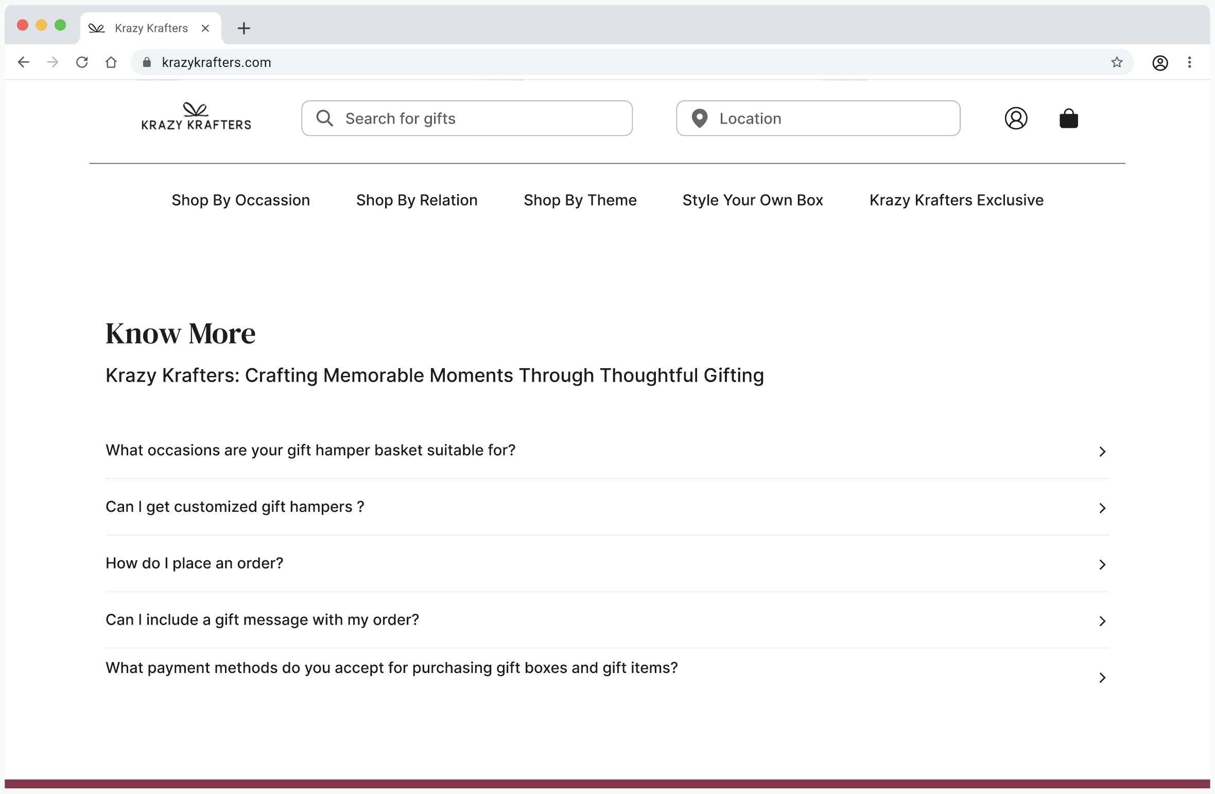
Enhancing customer support: FAQs section for quick resolution
To improve customer support and address initial queries, I designed a comprehensive FAQs section at the end of the landing page. This UI element is crafted to provide quick, accessible answers to common questions, reducing the need for direct customer service interactions.
Enhancing navigation and accessibility
To improve overall user experience, I designed a comprehensive and user-friendly footer for the landing page. This footer includes essential links such as Contact Us, About Us, Privacy Policy, Terms of Service, and social media icons, providing quick access to important information. The footer also features a subscription form for newsletters and updates, encouraging user engagement and retention.

Prototype
Revamped Landing Page Prototype
The home page becomes the first page users land on after they log in. They can easily navigate between the sub-pages in the dashboard to find what they need. This new home page is highly user-friendly.
Next Steps
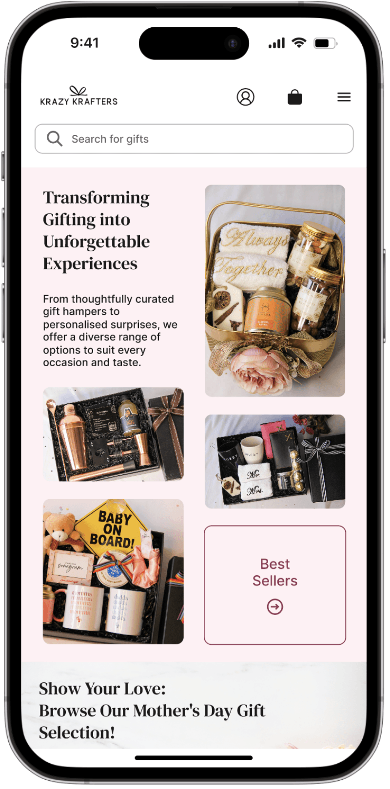
1. Improve responsiveness on mobile and tablet
2. Design empty states to be more intuative
3. Implement further customizations on other pages of the website
Reflections
By restructuring the layout, optimizing performance, and implementing clear navigation elements, I was able to create a more user-friendly experience.
One aspect of the redesign that stands out to me is the strategic arrangement of information.
Another key element of the redesign is building customer trust through transparency. By displaying relevant numbers and statistics.
2025
Designed by Manasi with passion, late nights, and an endless obsession with the little details.
