
Mobile Interface
Web Interface
Expedia Quest: Travel, Play & Win
Role
Visual Designer
Timeline
Nov 2023 - Dec 2023
Industry
Travel Technology
Team
Manasi Nipane
Abhijit Barman
Anand Kalukae Atharv Joshi
Disciplines
Visual Design Interaction Design
Prototyping
Tool
Figma
Project Overview
A user-friendly experience on Expedia for diverse travel challenges. The Travel Challenges section inspires users with unique experiences and rewards them for achievements with exciting prizes.
The design incorporates gamification elements and effortless integration with the booking platform for a holistic and engaging travel experience.
Over 1 month, my cohort team developed a mobile app feature for Expedia. As the UI designer, I worked with the team to evaluate the problems and business needs of Expedia and propose a feasible design solution.
Problem
Travelers fail to accomplish their travel goals due to uncertainty, motivation, and a lack of recognition for their achievements.
Lack of Inspiration

Travelers are unsure where to go or what to do when they travel.
Lack of Motivation

It can be difficult to stay motivated to achieve travel goals.
Lack of Rewards

Travelers are not rewarded for their travel accomplishments.
The Solution
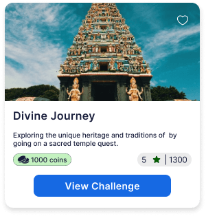
Travel Challenges: Inspiring Travel Goals and Rewarding Experiences

How might we inspire users to travel more and plan better itineraries?
Users can effortlessly choose from a variety of travel challenges.
Serves as a motivating factor for users to enhance their travel experiences.

How might we boost user motivation for achieving travel goals and ensure fulfilling journeys?
Users receive a comprehensive travel itinerary to guide them during their journey.
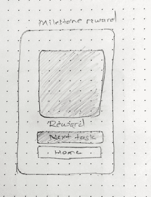
The Memory Wall, earned by completing all challenges, motivates users to accomplish tasks.

How might we improve the rewards system to better support users in accomplishing their travel goals?
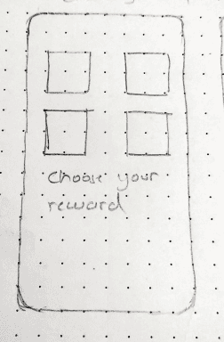
Users are offered a diverse selection of reward coupons.
These coupons are redeemable on Expedia for booking flights or accommodations
Process & Reasons
How does Expedia compare to other platforms?
We conducted an in-depth exploration of the App Store to identify travel apps that excel in using gamification elements to boost user retention. By analyzing user reviews and app features, we also pinpointed which popular travel apps were missing this engaging component.

Booking.com

Make My Trip

Polar Steps

Roadie

TripIt
Major Insights from Secondary Research
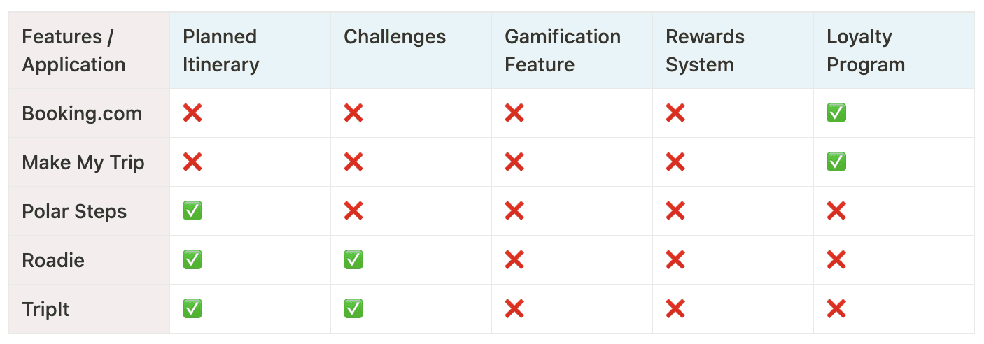
Design decisions in this project were guided exclusively by secondary research, as no user interviews were conducted. We utilized existing data and insights to drive the design process.
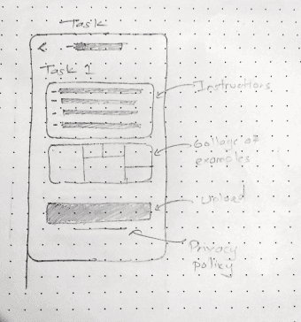
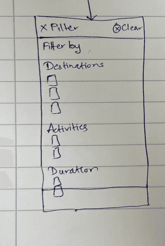
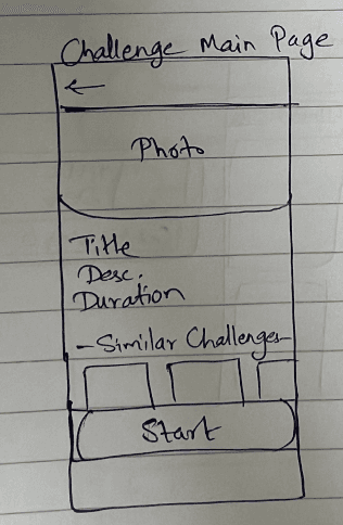
Wireframing to Prototyping
What could our new screens look like?
We designed low-fidelity wireframes to visualize the new layout and navigation. Afterwards, we built a high-fidelity, interactive prototype to test the design.
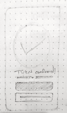
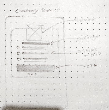
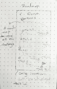
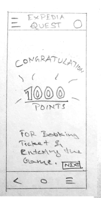
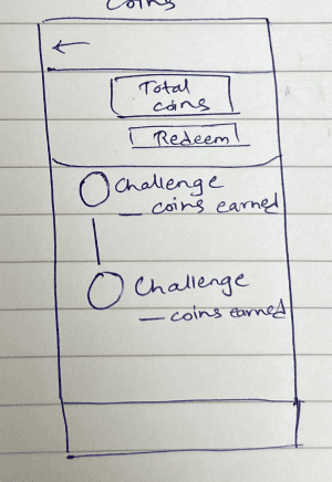
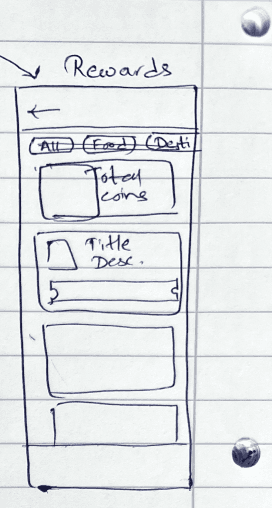
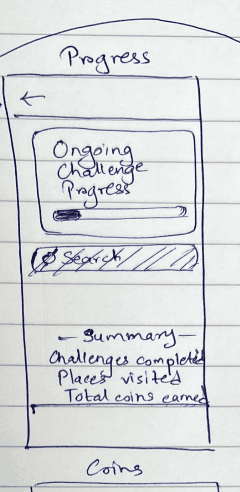
Initial Sketches

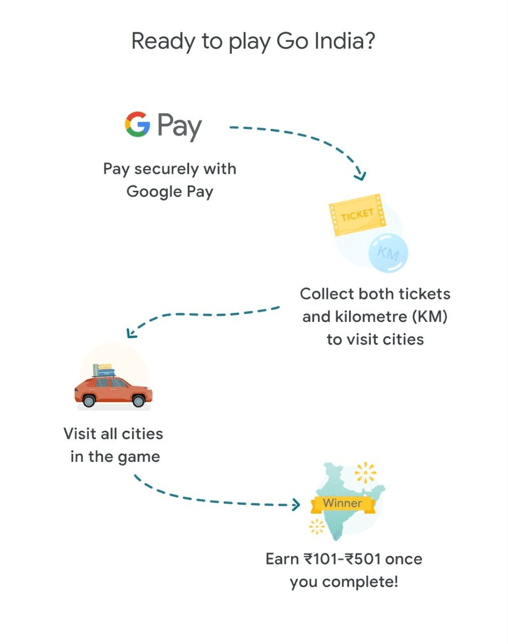
Inspiration Mood-board
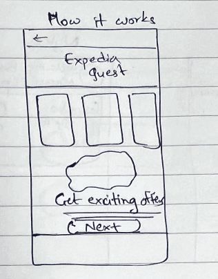
We drew significant inspiration from Duolingo's use of gamification to enhance user retention and Google Pay's implementation of games to encourage users to return to the app for the chance to win rewards.
Dulingo
Google Pay

Memory wall as end reward
Solving granular design problems
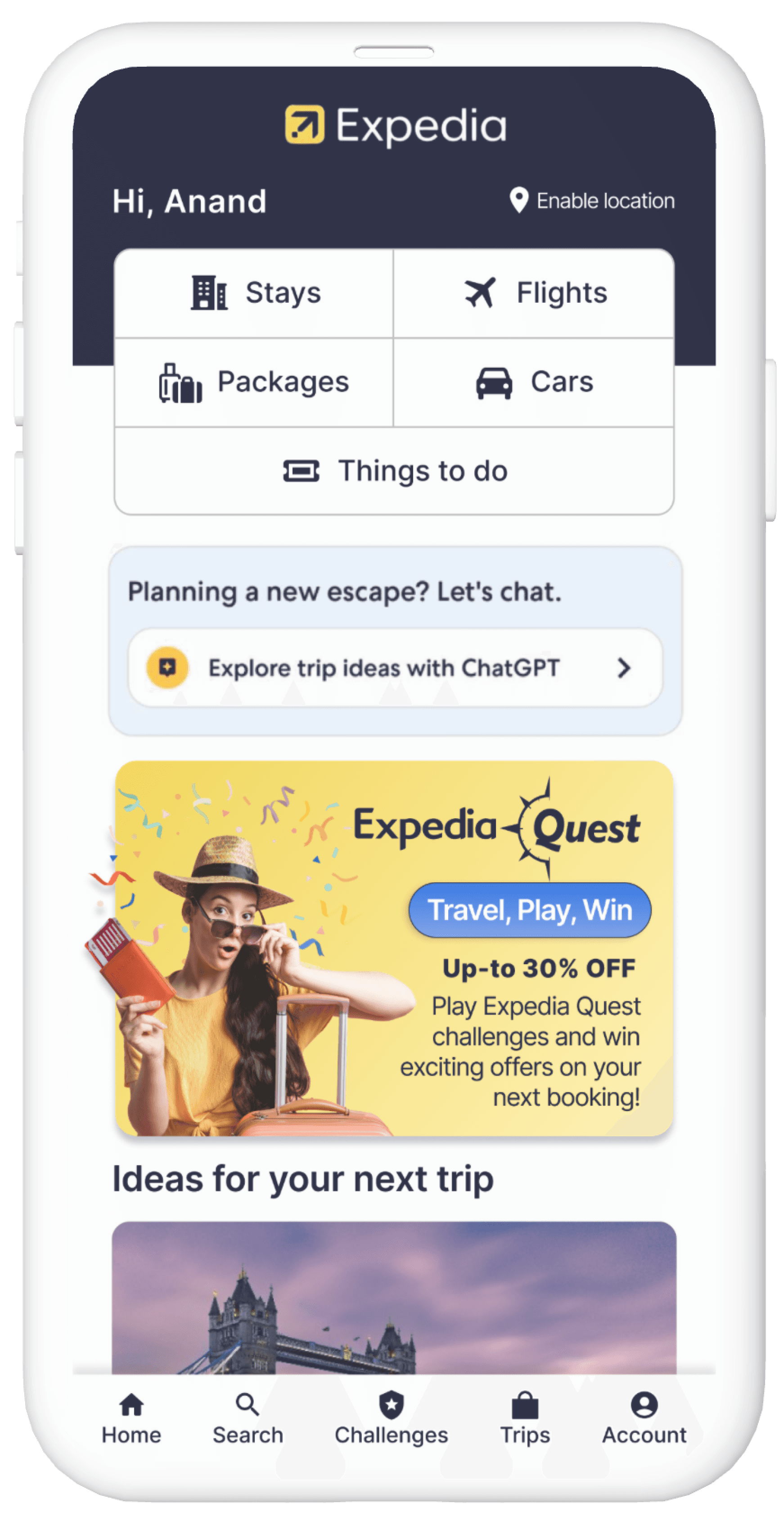
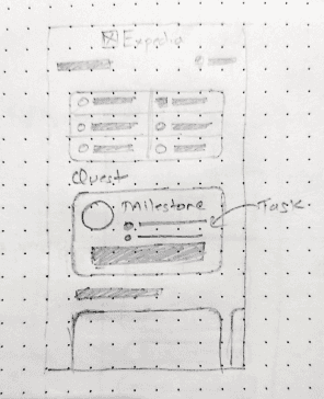
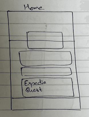
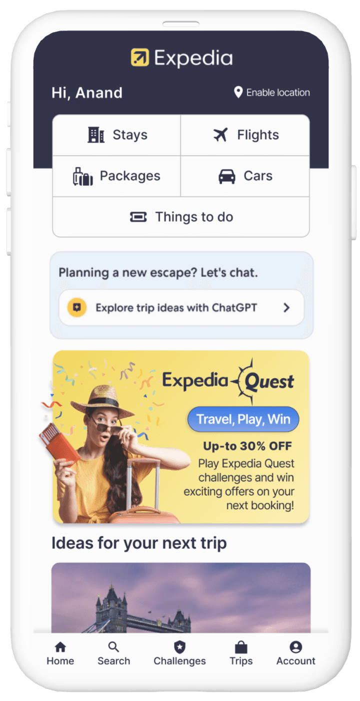
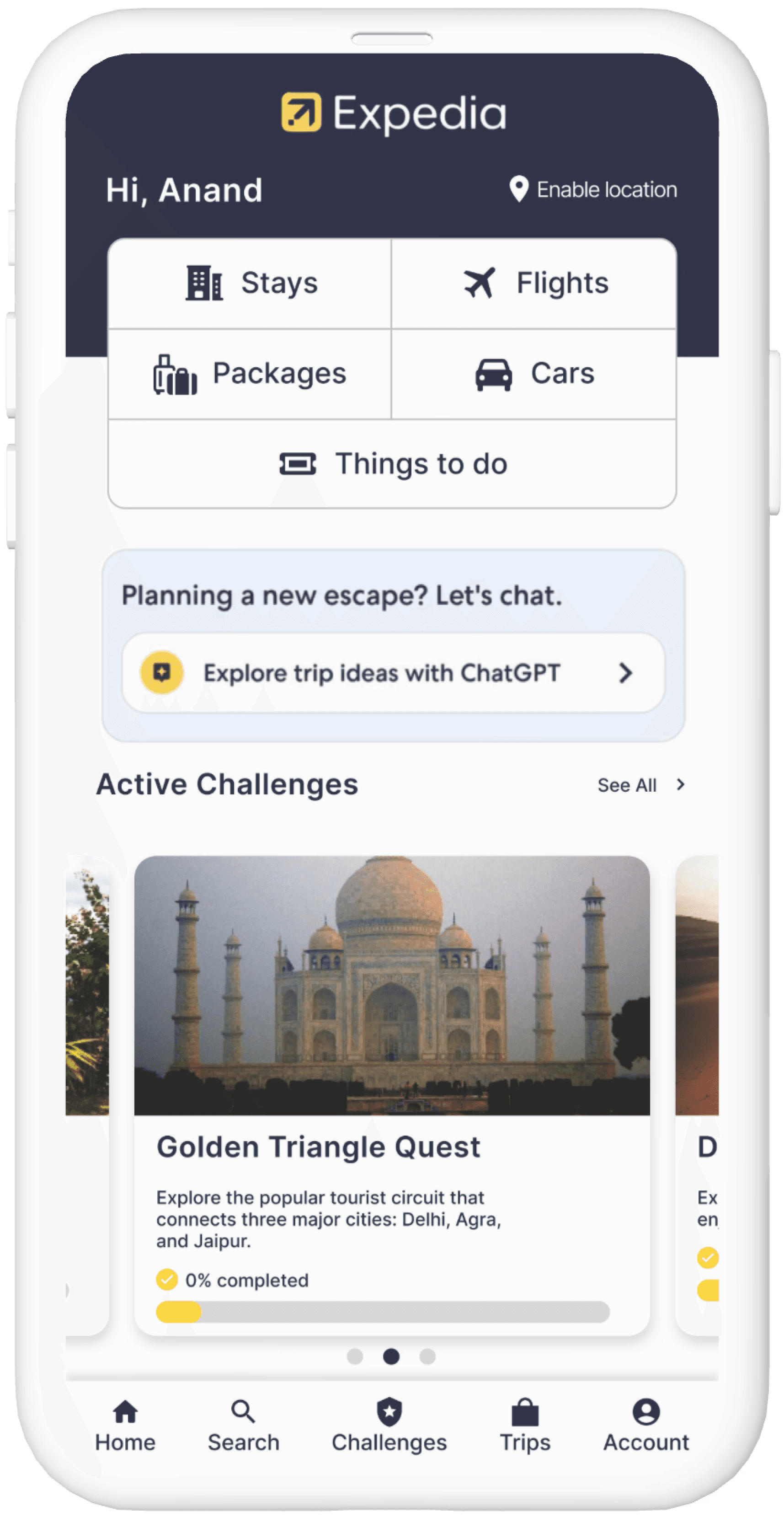
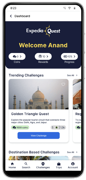
Introduction of 'Travel Challenge' feature in the app
A banner on the main screen and an icon in the bottom navigation bar for accessing the challenges.
This dual approach enhances accessibility by providing immediate visibility through the banner and easy, consistent access through the navigation bar, seamlessly integrating the new feature into the app’s existing interface.
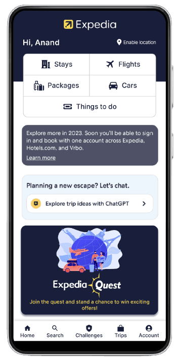
Homepage Before

Homepage After

Challenges
Maintaining intuitive navigation for users to discover and engage with challenges
To ensure intuitive navigation for users to discover and engage with challenges, we implemented the following features in the app.
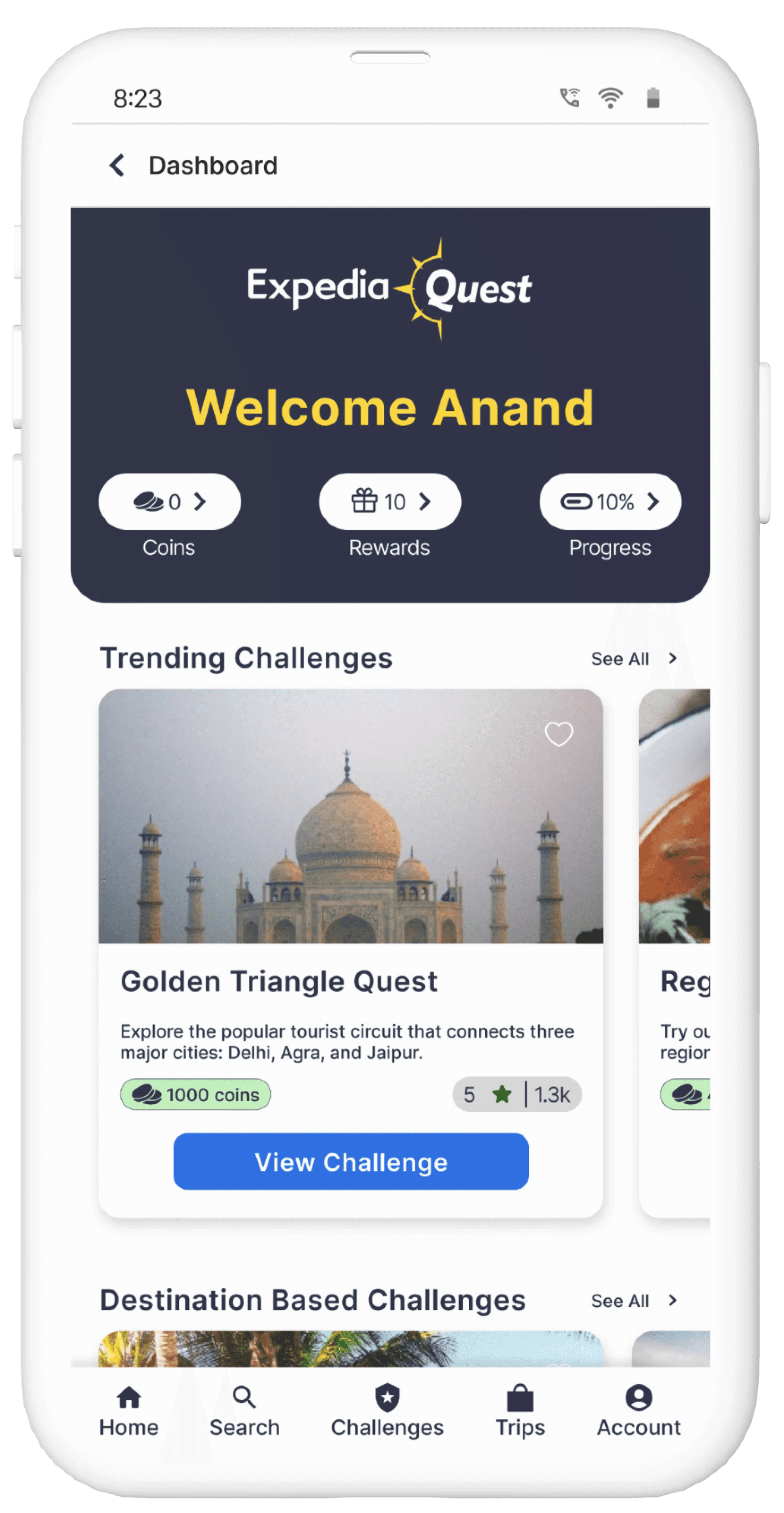
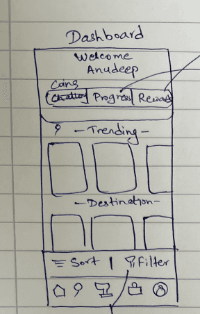
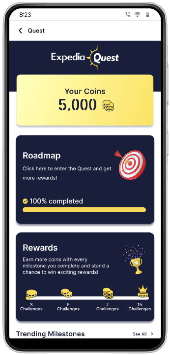
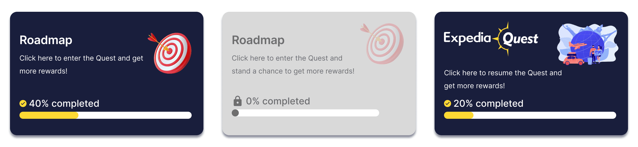
Expedia Quest Dashboard
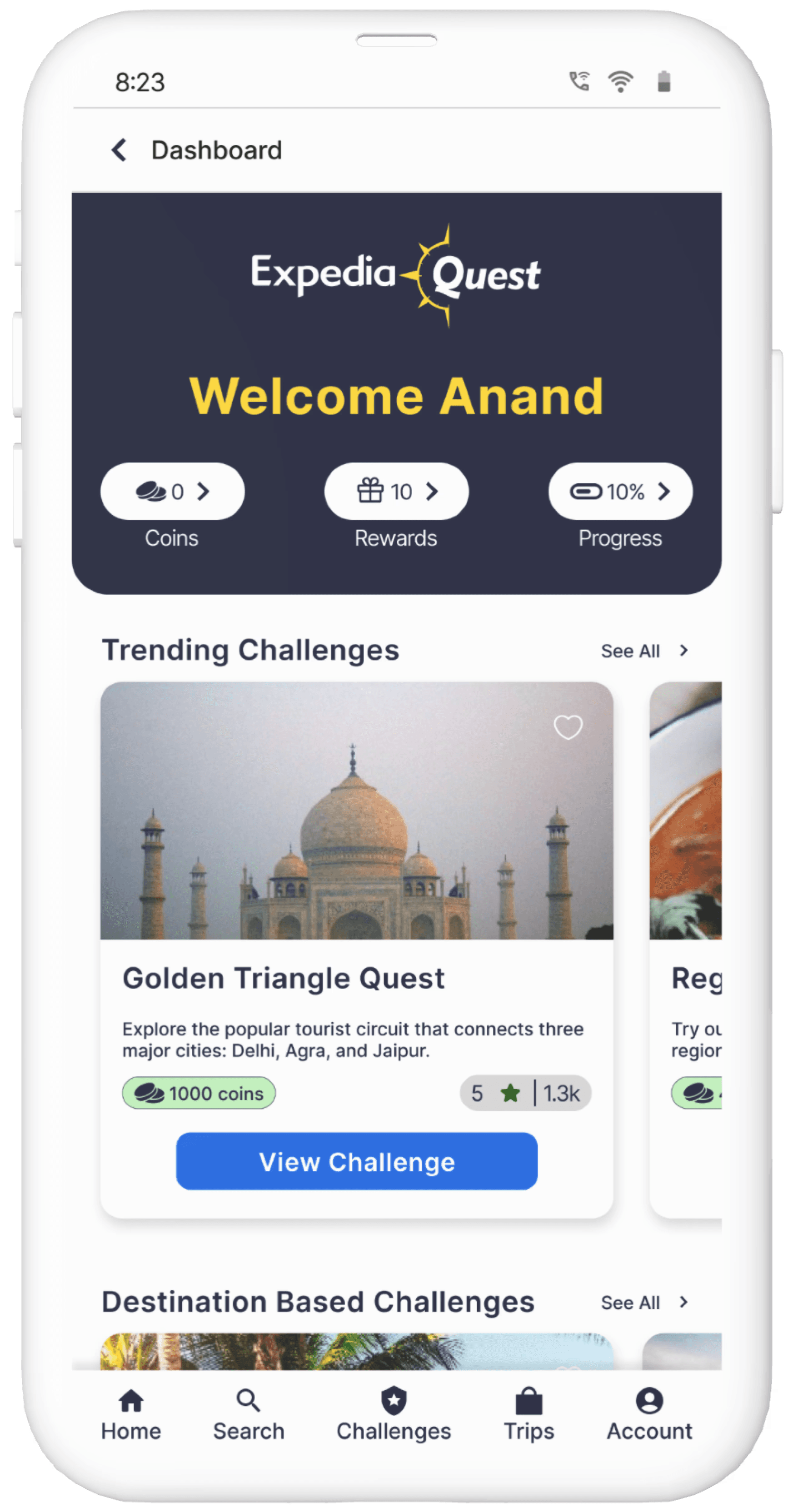
A centralized hub where users can easily find and track ongoing challenges.
Restart Quest from Homepage
Quick access from the homepage to restart previously attempted quests, enhancing user convenience.
History of the Quests
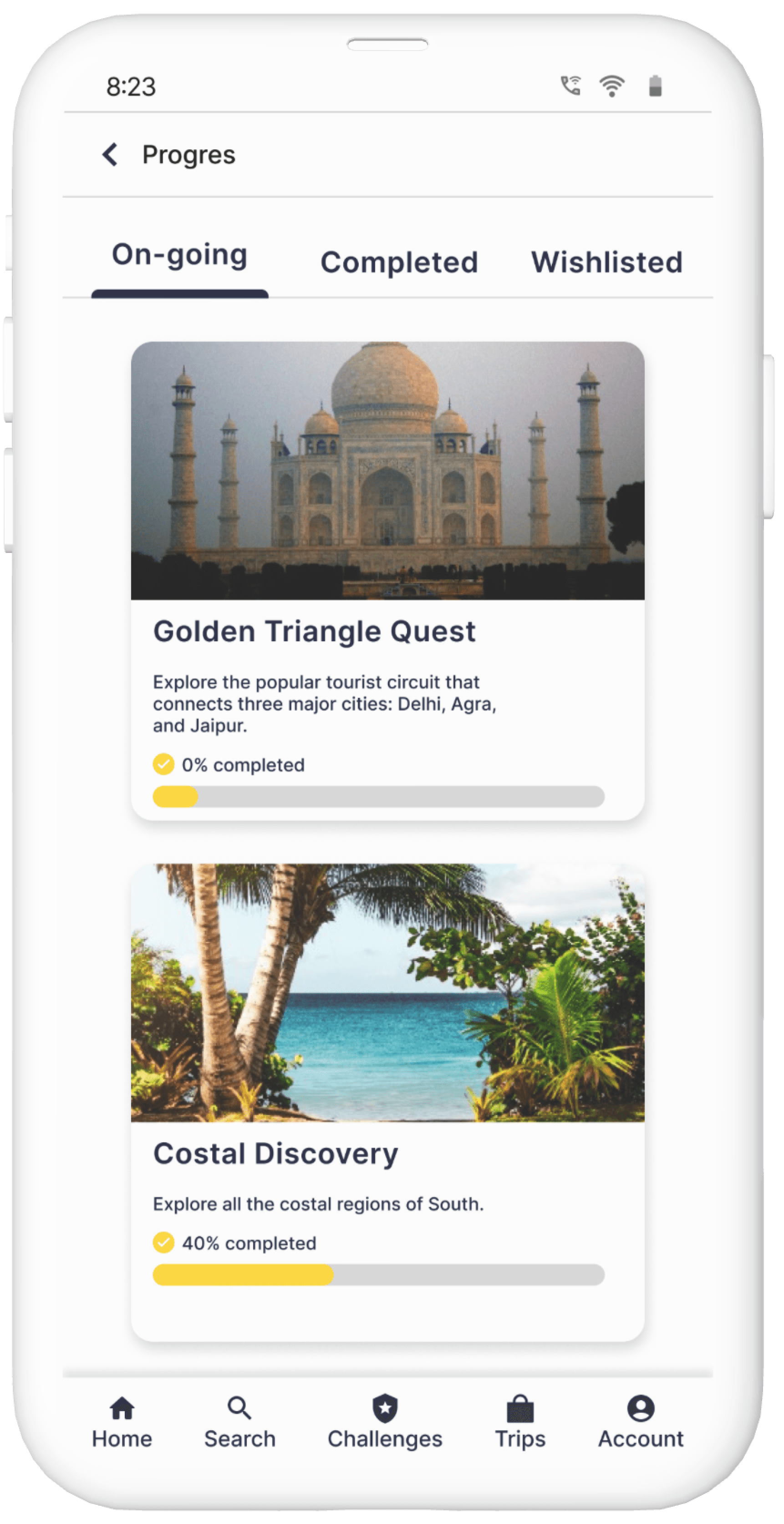
A dedicated section to view the history of all attempted quests, allowing users to revisit and manage their past activities.
Ensuring visual consistency
Creating text and color styles, along with an icon library, that seamlessly integrate with the existing app's visual design.
Typography
Titles
Title1, Semi Bold, 16
Title2, Semi Bold, 14
Body Text
Body-Text1, Medium, 18
Body-Text2, Medium, 16
Body-Text3, Regular, 14
Body-Text4, Regular, 12
Body-Text Small, Regular, 10
Headings
Heading1, Medium, 20
Heading2, Semi Bold, 18
Heading3, Semi Bold, 16
Image Headings
Image Heading1, Bold, 32
Image Heading2, Bold, 28
Iconography
Colors
Icon Primary Color
Primary Color
Secondary Color
Tertiary Color
Image Text Color
Success Message Primary Color
Success Message Secondary Color
Error Message Primary Color
Error Message Secondary Color
Text Card Primary Color
Text Card Secondary Color
Visual Design Iterations
How User Testing contributed to refining the screens?
We conducted usability tests with a diverse group of users to validate the design and identify areas for improvement. Based on the feedback, we made necessary adjustments to the design.
Expedia Home Screen
A lack of clarity about the challenge, with the name not conveying a gaming aspect
Users were uncertain about the rewards they could ultimately earn
Before
After
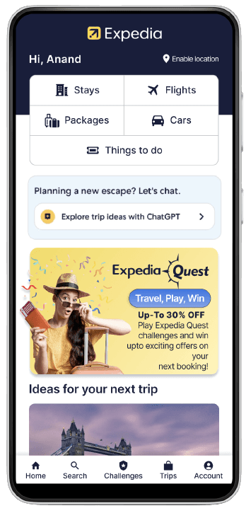
Changed the banner with a vibrant image, introduced the tagline 'Travel, Play, Win,'
Clarified that users could earn rewards discount by participating in the challenge.
Expedia Quest Dashboard
Confusion regarding the roadmap and rewards cards.
The roadmap doesn't specify which challenge is ongoing
No proper visual and information hierarchy
Before
After
Restructuring coins, rewards, and progress status into separate tabs
A more streamlined and compact layout for enhanced user experience
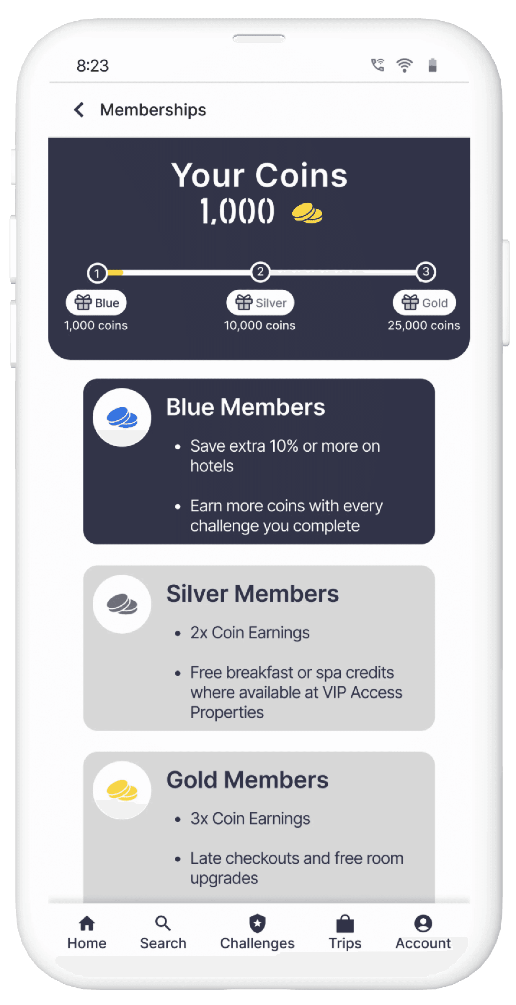
Rewards Screen
Confusion and disorientation with the previous interface
Before
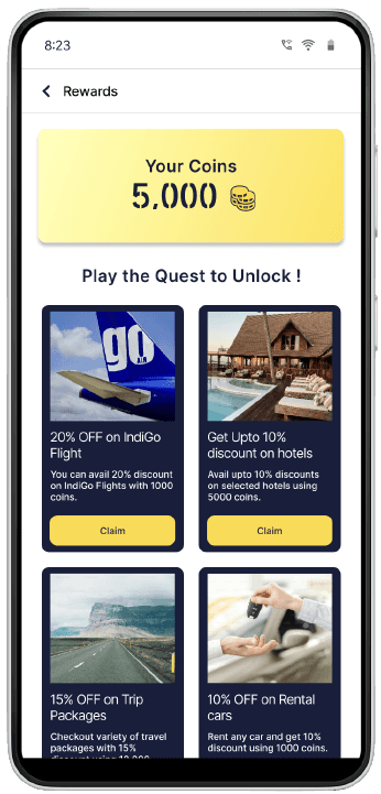
After
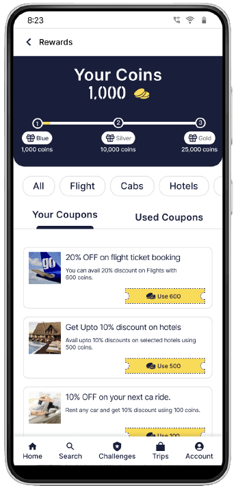
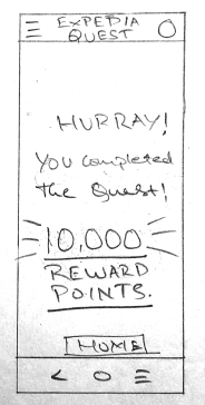
Converted rewards into coupons for increased real-world familiarity
Introduced a new tiered system: 'Blue,' 'Silver,' and 'Gold' memberships
Component Insights
Crafting better quest cards
A seemingly simple component turned out to have numerous parameters that significantly impact the user experience. Below are some insights and design decisions I considered to create an exceptional experience.
Implicit Version
The cards failed to indicate the information of ongoing challenge.
The information provided was insufficient.
Poor visual hierarchy making it difficult to prioritize information.
Unclear call-to-action buttons.
Inconsistent visual design elements.
Explicit Version
The cards convey better information of ongoing challenge.
Providing detailed information including challenge descriptions, rewards, and user reviews.
Clear call-to-action buttons.
Consistent visual design elements.
Developing multiple variants for the various elements of the Expedia Quest feature.
I created multiple variants for key elements of the Expedia Quest feature, including buttons, offer states, task states within challenges, and membership states. Each variant is crafted to enhance the user experience, ensuring consistency and clarity across different scenarios and interactions.
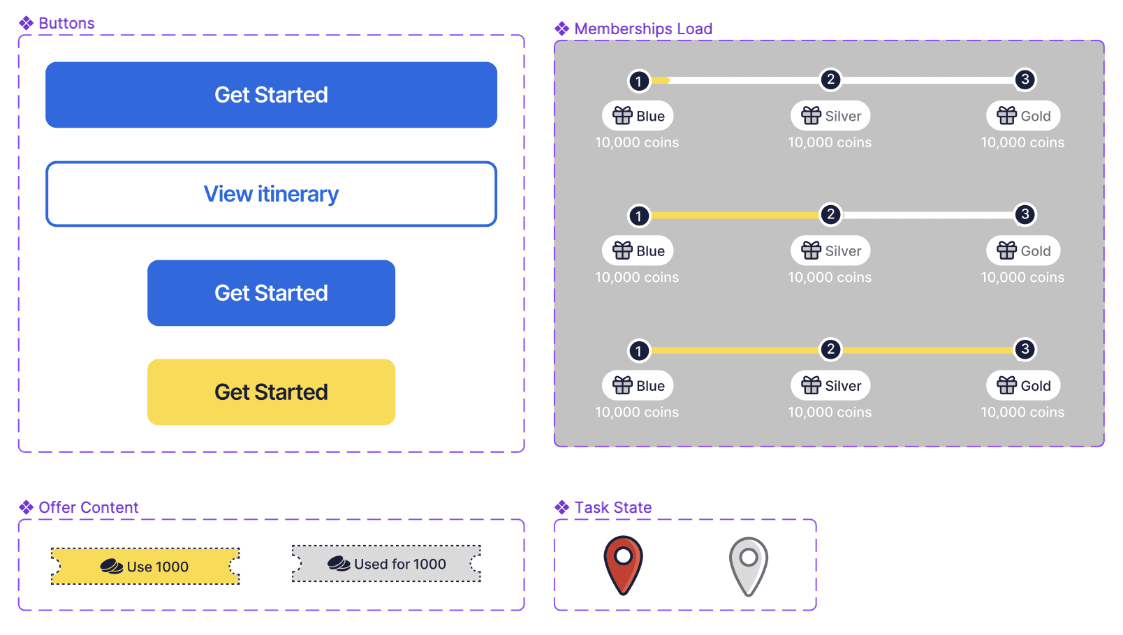
The button variants cater to various call-to-actions at different stages in the app.
The offer states indicate different stages of reward availability.
The task states provide a clear progress indicator throughout the challenge.
The membership states reflect different levels of user engagement and benefits.
Key decisions made during the journey
The reason behind strategically incorporating 'Blue', 'Silver', and 'Gold' membership tiers around the challenges.
The reward system was already in place within the app; we designed the challenges to complement this system, benefiting both users and the business.
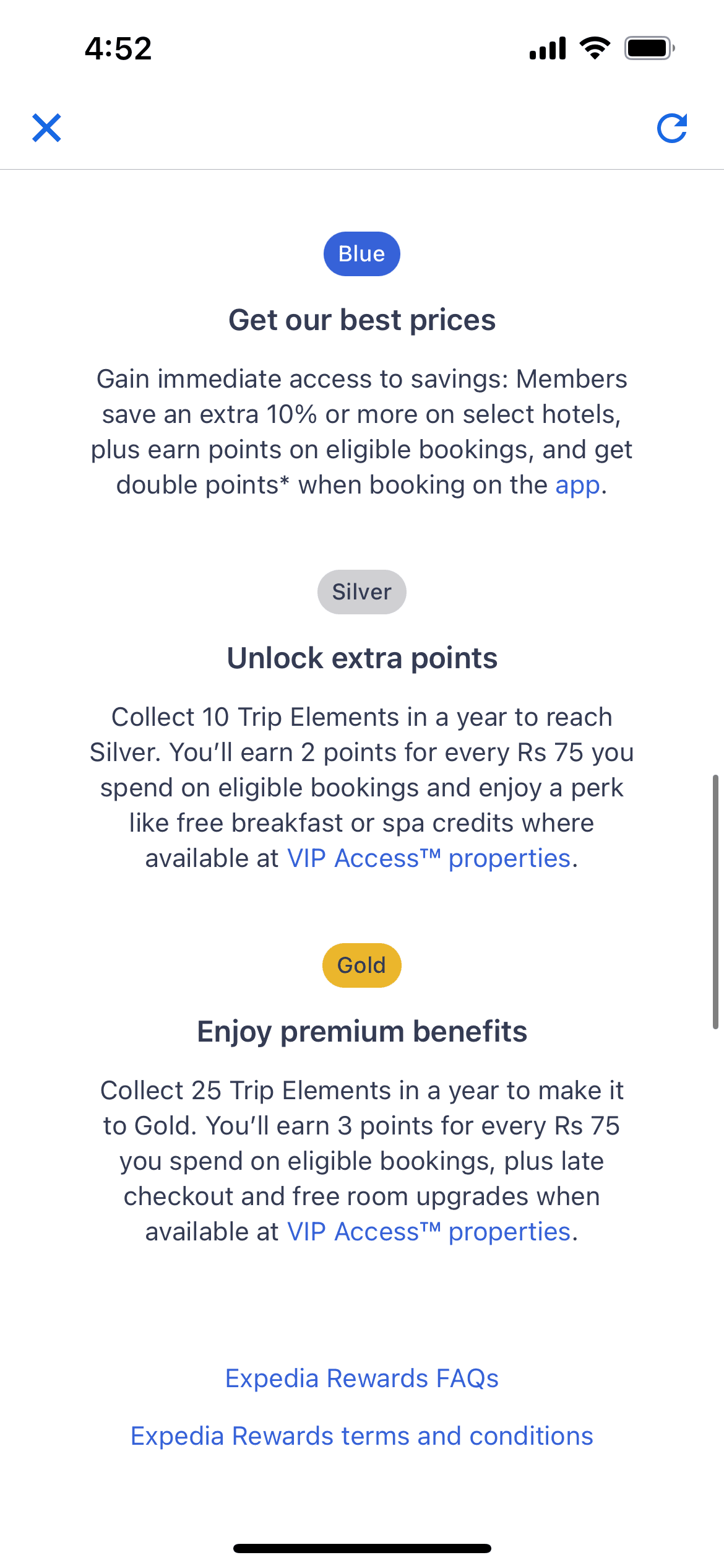
The 'Blue,' 'Silver,' and 'Gold' reward tiers are specifically crafted to offer users a variety of perks and exclusive deals from Expedia.
An added advantage for Expedia's business growth, ensuring users stay actively involved and invested in the platform.
Reward users with 100 coins for accomplishing each task within a challenge.
This decision is based on the strategic goal of offering users a immediate incentive upon task completion.
By consistently providing users with tangible rewards for their efforts, we cultivate a sense of accomplishment and sustained motivation throughout the challenge.
Reflections
User-centered design is an iterative design process that focuses on the users and their needs in each phase of the design process.
Understand the reasoning behind each design choice, supported by user research.
Usability testing is a critical step in the user flow process. Identifying diverse user types and unique scenarios helps in finding better solutions.
Manasi Nipane
2024